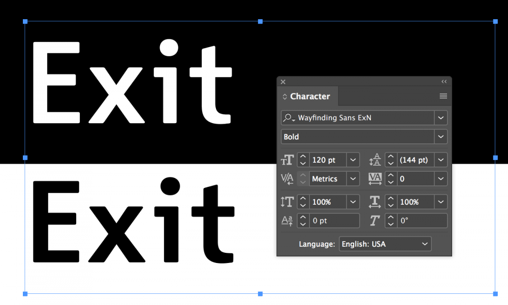
Every style of Wayfinding Sans Pro comes in a version for positive and negative contrast. This compensates for the effect, that light text on dark background looks bolder than dark text on light background. By using the positive and negative versions of Wayfinding Sans Pro your text will appear optically corrected, when both contrast types are used on one sign.
Use the negative versions for light text on dark background and the positive versions for dark text on light backgrounds.
You only need the positive and negative version of a style if you have both contrast types on one sign. Otherwise you can just use the default style, which is the “negative” contrast version. Even though it is called “negative”, it doesn’t mean it shouldn’t be used for signs with only a positive contrast (i.e. dark text on light background).


