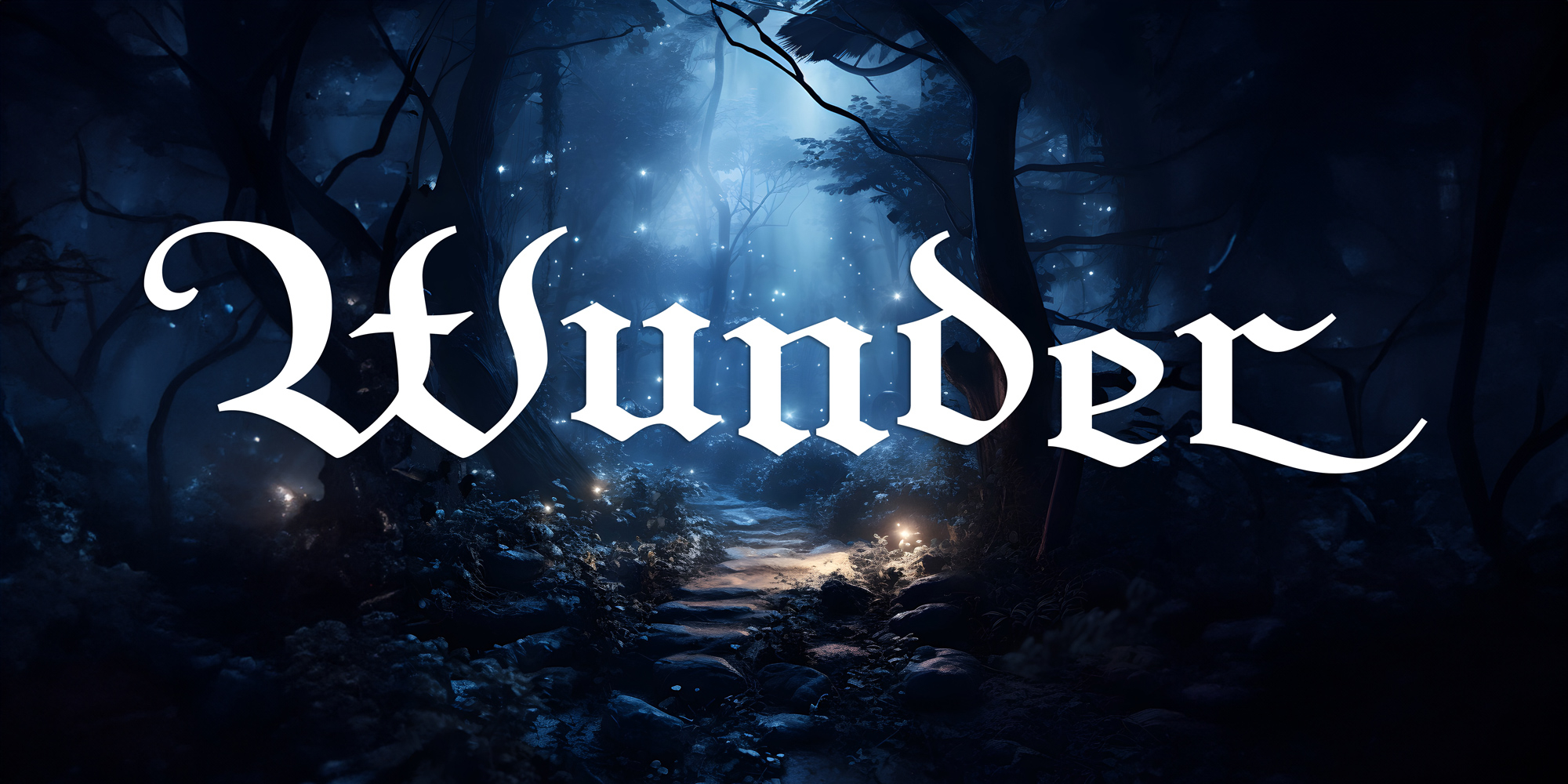
Wimaria Gotisch was digitized from an original letterpress font of “Element” originally published in the 1930s by the Bauer type foundry. The design was extended to include a complete Western (Win 1252/Mac Roman) and Central European character set. The optional decorative caps are included as OpenType swash glyphs. In total, the font contains 462 glyphs.
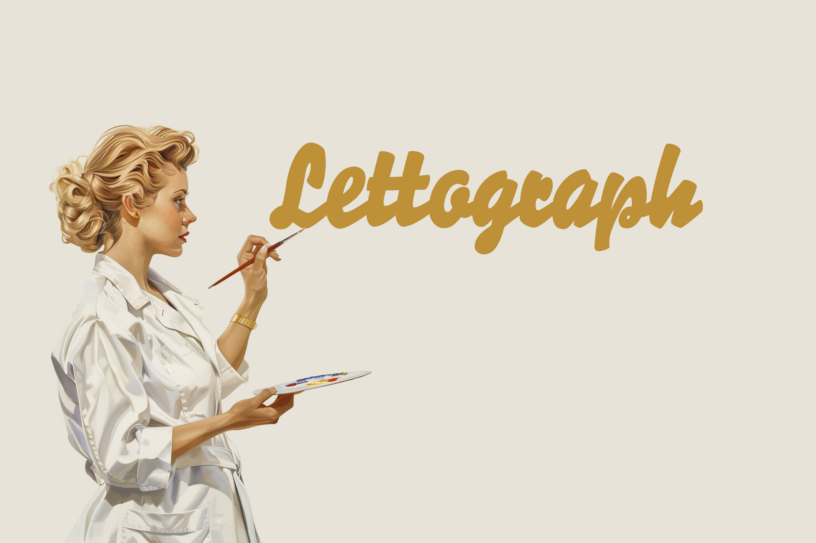
After last year’s successful Kickstarter campaign, we digitized the Berthold’s Signal font family as FDI Lettograph. Part two of the project was the creation of vector color fonts in addition to the regular OpenType fonts. The color fonts have now been released under the name FDI Kromograph.
FDI Kromograph comes in two styles:
FDI Kromograph A is a color font with 5 layers and a 3D effect.
FDI Kromograph B is a color font with 3 layers and a color change effect, which is activated through the OpenType feature “contextual alternates”.
Both designs come with 10 predefined color palettes, which can be used in desktop design applications which support OpenType SVG fonts. An additional WOFF file implements the color palettes as COLR/CPAL font. The colors can be overridden using CSS.
All styles come with a complete Western Latin (Win1252/Mac Roman) character set and contextual alternates for the beginning and end of words.
A mid-century German lettering style as SVG and COLR fonts
After last year’s successful Kickstarter campaign, Berthold’s Signal fonts have now been digitized. The Kickstarter supporters got early access to the revival type family, which is called FDI Lettograph. As part of a soft release, supporters of our community platforms Typography.guru and Typografie.info now also get early access before the final public release of FDI Lettograph in 2025.
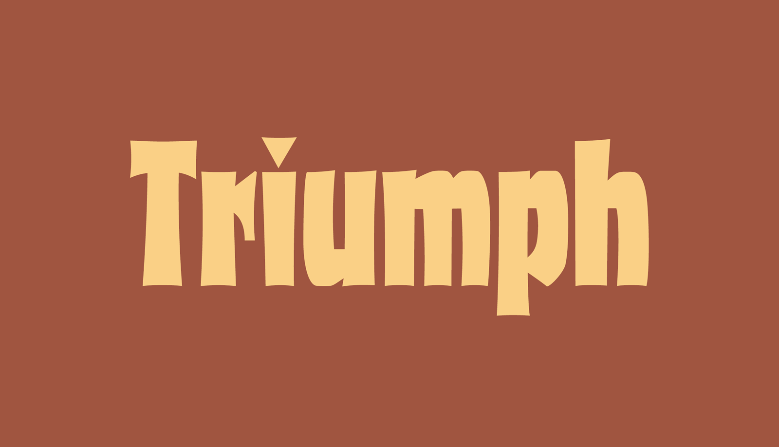
We are happy to present another font revival based on the works of the underrated type designer Albert Auspurg. After Krimhilde, we now also offer his design Triumph under the name FDI Triumph. The typeface was originally released in 1929 in one bold style, following type designs such as Fanfare and Alarm.
FDI Triumph is a careful and authentic digitization using the original wood type font and the original character set was extended to now cover the Western codepages Mac Roman and Win 1252.
“Mainzer Initialen” was published at the beginning of the 20th century by the type foundries Ferd. Theinhardt and H. Berthold in Berlin. FDI Mainzer Initialen is a carefully digitized interpretation, extended to three colors and made available in modern color fonts formats. The package contains OpenType SVG fonts with 10 color palettes, which can be used in desktop applications, as well a single COLR/CPAL font, which gives access to the 10 palettes via CSS.
Initials as modern color font for desktop and web use
We are happy to announce a new FDI release: FDI Reklameschrift is a carefully crafted digitization and extension of “Reklameschrift Bombe”, originally released in 1908 at the type foundry Ludwig & Mayer. FDI Reklameschrift covers Western, Eastern and Central European Latin and comes in two versions: Version A is as close as possible to the original design, containing some blackletter-style letterforms. Version B replaces these letterforms to improve legibility and allow a modern use.
A carefully crafted revival of a letterpress font from 1908.
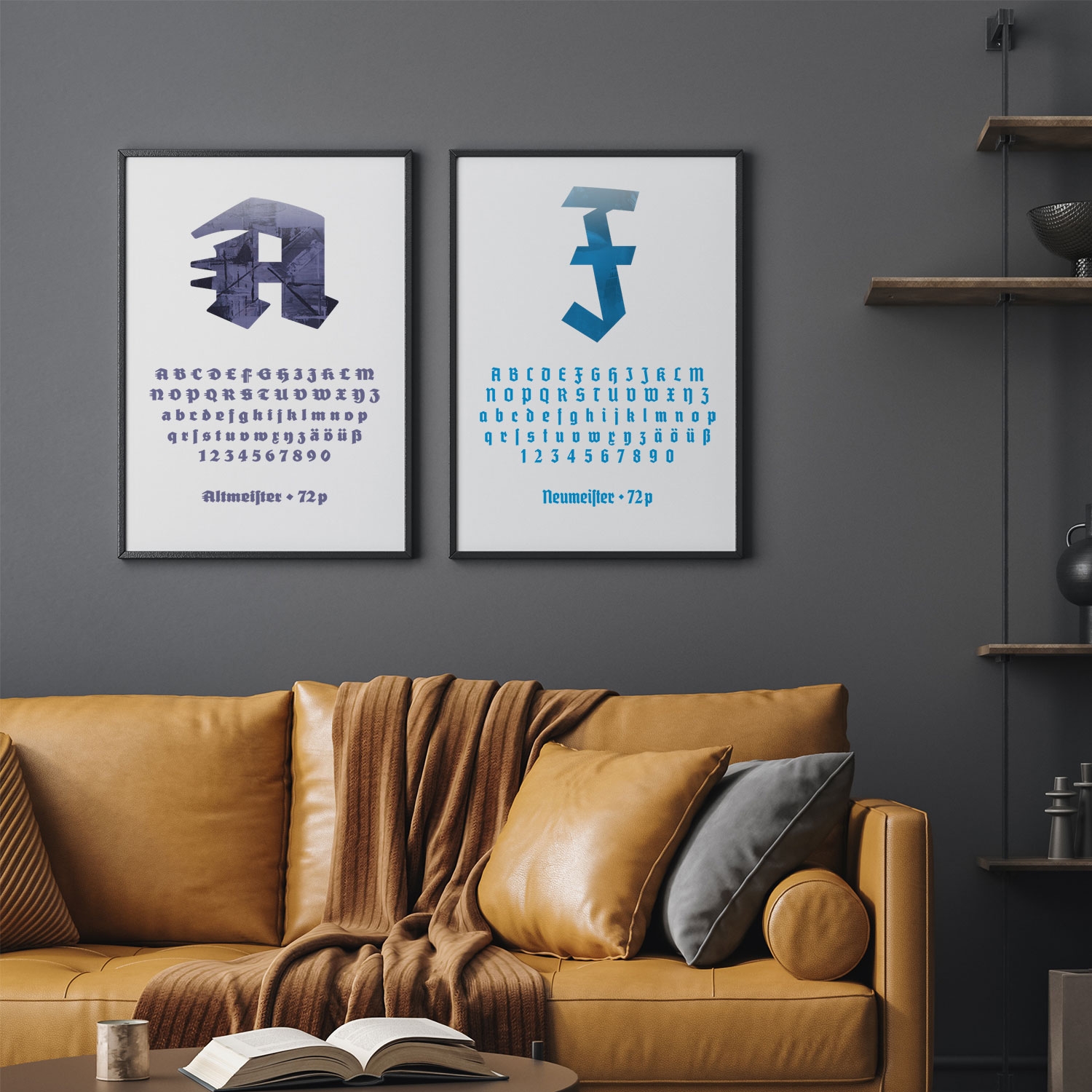
After one year in the making, we are happy to announce that the Deutschmeister project on Kickstarter is now complete. Thanks to the support form 77 supporters from all over the world, seven fonts were being created.
FDI Altmeister (A and B) and FDI Neumeister (A and B) were released for free under the Open Font Licence. And FDI Farbmeister is a set of three unique bitmap color fonts, which let you type with the look of real letterpress letters.
Follow the links below to learn more about the three font families.
Another successful Kickstarter campaign to revive interesting blackletter fonts
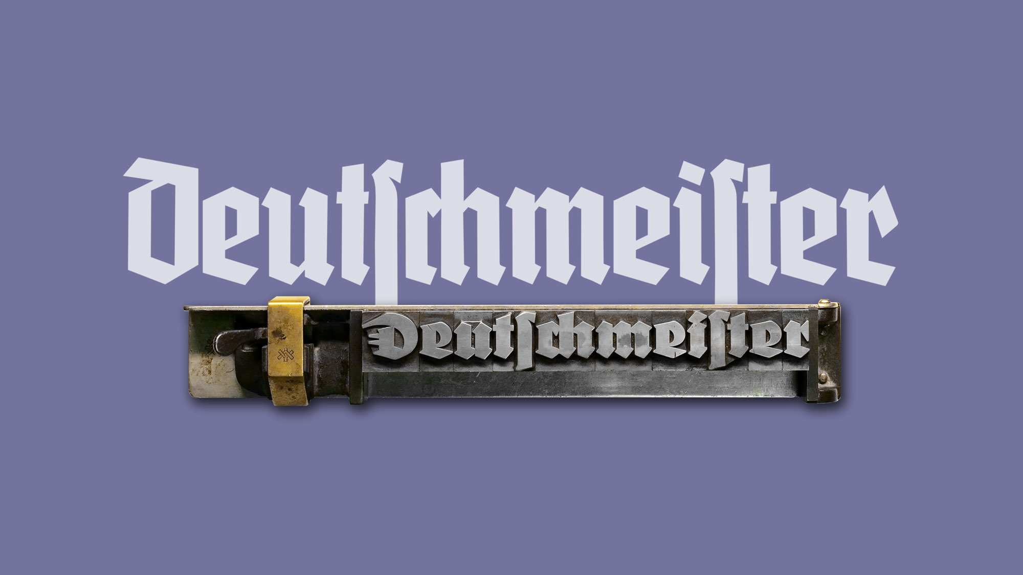
After last year’s successful Kickstarter campaign to revive the blackletter font Wiking, we are planning an even more elaborate project this year with a total of 6 fonts. And you can help to make it happen! We want to revive styles from a blackletter font family originally released during the 1920s and 1930s at the type foundry Ludwig Wagner.
If this campaign reaches it funding goal, a carefully crafted, complete digitization of two styles from the Deutschmeister font family will be created and offered for free under the Open Font License.
In addition, two color fonts will be created from the original letterpress fonts, so you can type with them on the computer as if you would create a letterpress layout.
The campaign runs until March 22, 2021.
☞ http://kck.st/2LThDUi
Six carefully crafted blackletter revival fonts that even let you type with the look of real metal and wood type letters
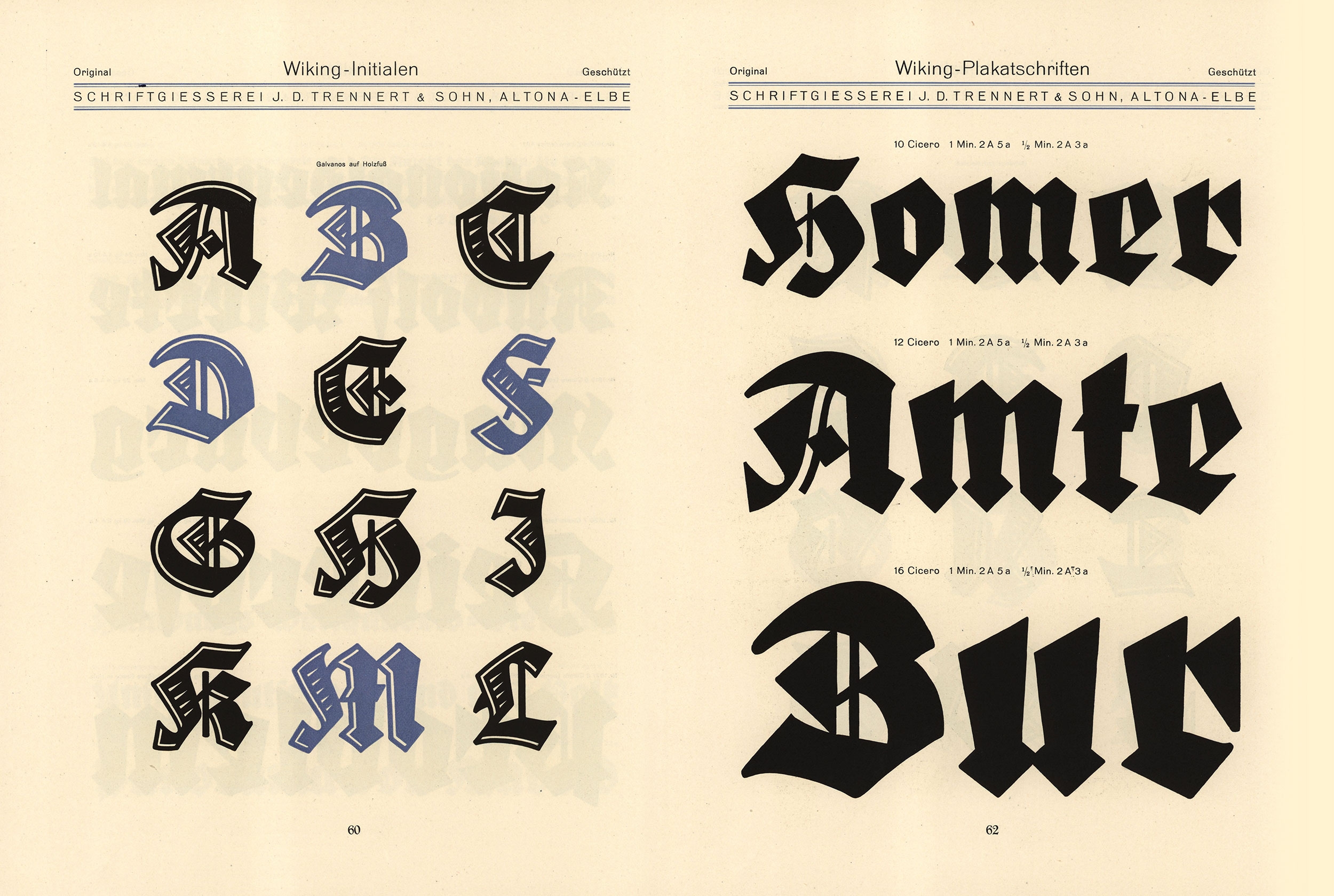
The Wiking typeface was designed by Heinz König and published in 1925 by the type foundry J. D. Trennert & Sohn in Hamburg. This unique and contemporary blackletter design has never been professionally revived. But you can help make it happen. We want to create a careful and complete digitization of the font and offer it for free under the Open Font License so that the original design by Heinz König can get the attention and use it deserves. Please consider supporting our project and check out our Kickstarter campaign here: http://kck.st/38dMzEL
We are pleased to announce the release 2.0 of Wayfinding Sans Symbols. It includes 32 additional symbols added by request of our customers. Check out the last page of the code chart PDF to see all additional symbols.
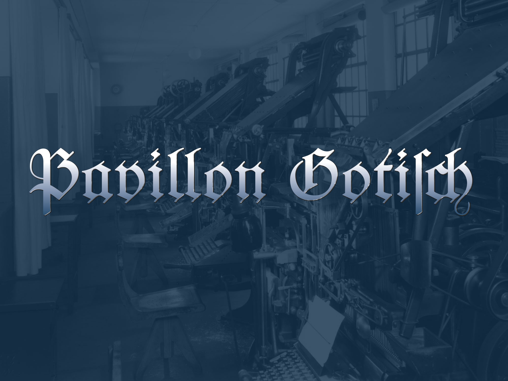
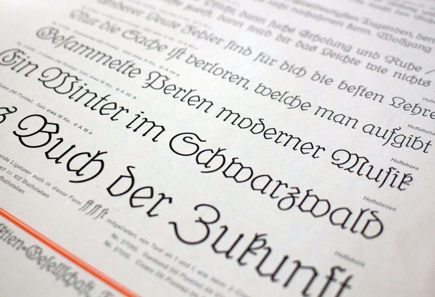
After Elfen-Fraktur and Krimhilde, Pavillon Gotisch is our third revival of a German blackletter font from the early 20th century. The original letterpress font is available in two sizes in the printing museum Pavillon-Presse in Weimar and was digitized from prints made in the museum. The design was extended to a full Latin 1 character set as “Pavillon Gotisch A” and contains the original ligatures and swash letters accessible through OpenType. The second style (Pavillon Gotisch B) contains “romanized” glyph designs to make the font more legible to everyone who isn’t familiar with the traditional German blackletter shapes.
You can read more about Pavillon Gotisch on Typography.Guru: https://typography.guru/journal/blackletter-revival/
Reviving a blackletter font from a museum’s archive
We are happy to announce our latest release: a revival of the Krimhilde typeface, originally released in the 1930s. Krimhilde has a unique design mixing elements of geometric sans and blackletter. You can learn more about the history of this typeface in this article on Typography.Guru:
https://typography.guru/journal/fdi-krimhilde/
Krimhilde—a typeface mixing elements of geometric sans and blackletter
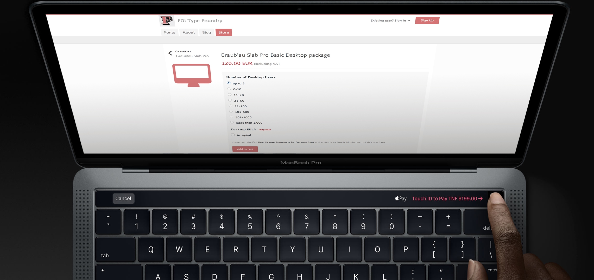
In addition to our two standard payment methods PayPal and credit card (Visa, MasterCard, American Express) we just made more options available.
Pay directly through your browser by using either Apple Pay or Google Pay with supported devices and browsers.
For our European customers we added the popular local payment options SOFORT (by Klarna), GiroPay and iDEAL. Those options are shown automatically if you order from a country where these services are available.
All transactions are of course processed securely over a fully encrypted connection.
Sebastian Nagel studied graphic design at the University of Applied Sciences Vorarlberg in Austria and is currently working as graphic and type designer. At fonts.info he has released typefaces such as Iwan Reschniev and Tierra Nueva, but he also has a lot of interesting typefaces still in the desk drawer.
How did you become a type designer?
I once bought one of those CD packages with 10,000 typefaces for 10 bucks in a local supermarket—the quality of those typefaces was of course miserable but the versatility of type and type use started to fascinate me. And during my study at the university my interest in typography and type design grew even more. I just loved the balance between freedom and convention that typography and type design requires. Some of my teachers probably found this approach to boring, but luckily I also had some teachers who supported me in my rather slow and analytical design approach.
Which role do traditional and digital tools play in your work as a type designer?
As much as I would like to answer, that I do extensive calligraphic experiments, the truth is that I usually just sketch out some basic characters on paper and then quickly move the design to the computer screen, where can I can play and experiment with all the tiny details until they match my original ideas.
When the basic alphabet is drawn I also do a lot of testing in design application. Even when the font is targeted to print use, working with the font on screen in a design application is where the user “feels” the font for the first time—in terms of proper spacing, the behavior of OpenType features and so on. Many problems with a font appear at this stage and can be corrected instantly in the font editor.
After several proof runs and corrections I also do a lot of print-outs—both in the targeted sizes but also much larger. This helps to find tiny errors and inconsistent proportions, stroke widths, angles and so on. When the design of the letters is close to getting finished I am trying to use them in real-world projects with high-quality printing methods.
Just before the release I usually completely start over with the design of the PDF type specimen. It’s like the final proof, where I am trying to use the font without any manual corrections of spacing. The quality you see in the type specimen represents the fonts you would get.
Your Iwan Reschniev typeface emerged from a forum discussion and you have presented you work in progress on sites like Typophile.com and Typografie.info. How important is that kind of feedback to you?
When I was a beginner, such internet forums provided an excellent way to receive feedback, discuss design details and to compare my work and my way of working with those of other established type designers.
But I don’t believe the internet provides a very efficient way of learning to draw type. The feedback is of very mixed quality and everyone has its own opinion.
But what I do find extremely helpful are the ongoing discussion about design details, such as a recent discussion about the perfect placement of the @-sign compared to the baseline. Such discussions raise my awareness about certain design details and when I later design a typeface I am more familiar with all the possible options and the needs of the type users.
What is your opinion about the role of classical type-setting techniques in the education of today’s graphic designers?
I consider collecting, exploring and understanding of the historical methods and point of views as valuable and inspiring. Design, typography and type as part of the human culture and the current state of knowledge and methodology are the product of what we have perceived as right and useful. But our task is to build on that treasure trove of experience and to find new solutions, where the old methods are not adequate any more. Just sticking to the past, will not get us any further. You cannot blame a graphic designer of the 21st century, never to have worked with metal type-setting. Much of the old techniques and terms are of very little practical use today and will slowly disappear. That’s an inevitable development—which we shouldn’t try to speed up, but there is nothing to regret about it either.
Your most elaborate type design project so far was the creation of the Tierra Nueva type family. What did fascinate you about this project?
I simply love old maps. The are a testament of how people imagined the world around them. When I came across the map of America from Diego Gutierrez from the year 1562 I was blown away by the richness of detail. I especially like the type which was entirely made as copperplate engravings and consisted of several alphabets, including a Roman, a title-case version and a delicate italic.
What were the challenges in creating Tierra Nueva?
The look of the typeface is of course heavily influenced by the copper engraving tools, which don’t permit the flowing movements of writing with a quill. Instead each stroke is carved individually, usually without the possibility to change the direction while carving. This gives the typeface it’s chiseled and sturdy appearance.
The character set of the type family grew to over 1000 glyphs in the final upright versions: Small caps, title case, eight sets of figures, astrological and astronomical symbols, arrows, ornaments and a huge set of standard and discretionary ligatures. Without the intelligent OpenType feature replacements, the fonts would consist of 13 fonts instead of 4.
What other type design projects are you working on?
I am currently working on my biggest release so far: A friendly type family, which consists of a sans and slab serif and two alternative italics. I hope to finish it in 2012 or 2013.
Our foundry started in 2004 with the name and website “fonts.info”. FDI (short for “fonts dot info”) has been our official foundry vendor code since the beginning. Using a domain name as foundry name caused some problems in the past and the “info” top level domain has caused confusion regarding what that site would offer.
So some years ago we started phasing out the old foundry name in favour of “FDI Type Foundry”. This process was now completed with the move to a new domain: fdi-type.de. The licenses are not affected by this name change.
The completely redesigned website currently only presents our font library. The option to directly purchase licenses will be made available later this year.
Over the last couple of years I have researched the design and use of typefaces used for signage, especially road signage. While road signs in general are scientifically researched for many decades in western countries, little is known about the parameters that lead to a maximum legibility of typefaces used in signage. And therefore the range of typefaces used on road signs is pretty wide. We see geometric typefaces…
…slanted serif typefaces…
…and many old and modern sans-serif typefaces …
But which ones are most legible? Early road sign typefaces in the beginning of the 20st century were often designed by engineers with a strict geometric or grid-based approach. Newer designs, such as the new typeface in the Netherlands (see image above), are more based on the tradition of print typefaces. But in my opinion, both approaches have their drawbacks, because typefaces used for road signs have very unique requirements. Many people I have talked to seem to believe that speed might be the most important factor for the design of such typefaces, but that is actually not the case. The speed of motorists only influences the duration in which you can read the text on the signs. But that can simply be compensated by the size of the signs. What makes road signs so different from books and magazines is the variable reading distance. So if you want to improve the legibility of a typeface used for signage, the most important task would be to increase the viewing distance. If you are about to pass a huge motorway sign that is 50 meters away, legibility is no problem at all—the letters are so large, they could be set in Comic Sans and could still be read without any trouble. Where you can make a different thru type design is the moment when the motorist is at a distance where the text is just about to become readable.
A new approach
After traveling all over Europe for three years to experience and document as much road signage systems as possible, I started to design my own wayfinding typeface. This was part of my diploma at the Bauhaus University in Weimar, Germany. After all my practical and theoretical research it became clear to me that the regular way of designing a typeface on paper or on screen was not really appropriate. Because designing a typeface for a large viewing distance is not only a question of type design, it is also question of the feasibility of testing. To increase the viewing distance of my design I needed to experience my typeface in this blurry state where it is just about to become readable and I needed to test it when the visibility is decreased, for example by an overglow effect thru the headlights of a car.
That’s where I came up with the idea of my Legibility Tool Tool. It’s an OSX application that allows real-time simulation of different viewing conditions during the design stage. While I was working on the design of individual letters in FontLab, the tool showed me a simulated view of test words with the letters I was just working on. With this tool I could remove the guesswork and was able to optimize my design even for the worst reading conditions.
Often the simulations were quite surprising. Sometimes I was tempted to design my typeface in a way I was used to from the print world, but the tool clearly showed me that the reading conditions of road signs require a unique design for maximum legibility within this context.
Early version of Wayfinding Sans Pro
About the design
So how does the ultimate signage typeface has to look like? When I evaluated existing signage typefaces with my Legibility Test Tool it became pretty obvious that all those stylistic details that define the overall look of these typeface disappear under difficult reading conditions. What matters most is the skeleton of the letters. On one hand these letter skeletons should be very generic, so they easily match the visual patterns we have learned and seen so many times in our life. But on the other hand, they also need to be somewhat unique. The most generic letter forms do not necessarily create the most legible letters, because too generic letter shapes are harder to differentiate. So in my design I used average proportions as a starting point but I also tried to stress the individual character of each letter.
The “a” is a good example of this approach. The prominent stroke ending on the right may not be necessary to recognize it, but if it is there it helps to distinguish the “a” from other characters. Below is another example: Under difficult reading conditions, details such as the usually rather small crossbars of “f” and “t” get easily lost. Making these parts more prominent can significantly improve the legibility under difficult viewing conditions.
Top: German road sign font DIN 1451, Bottom: My wayfinding typeface
Certain letters can easily be mixed up under difficult viewing conditions. Designing those letters in a way where they are easily distinguishable makes the typeface more legible and increases the maximum viewing distance. Here are some examples…
The missing horizontal crossbar of the Dutch road signage font (orange) makes C and G harder to distinguish. In blue are C and G in my typeface. The difference between the letters is easily recognizeable.
Poor differentiation of O and Q in the French road signage typeface (orange). On the right are O and Q in my typeface.
Helvetica (orange) has many letters that are designed very similar, which is not really helpful when used for signage. A more unique design helps to differentiate the letters.
Another typical example: capital I, lowercase l and the figure 1 should better be designed in a rather unique way.
The stroke width is another important factor of a typeface used for signage. “The bigger the better” does’t work in this context—quite the opposite is true. Modern retroreflective sheeting of road signs create an overglow effect which affects the legibility. But this problem is not limited to road signs. Backlit signs in airports, hospitals and office buildings also suffer from this problem. The typeface design should compensate for this overglow effect. This can be achieved by using a thinner stroke width and by opening up the counters of the letters.
Top: Road signage typeface in Spain and Italy; Middle: Transport Bold (United Kingdom); Bottom: My wayfinding typeface
Figures are also crucial when a typeface is used for signage. In print typefaces the figures are mostly designed rather inconspicuously so they don’t stick out from the text. But figures in a signage typeface need to be very clear and easily distinguishable. The standard figures in my wayfinding typeface are tabular lining figures to accommodate the typical tabular use. But old-style figures (both proportional and tabular) are also available.
My wayfinding typeface also comes with a large set of arrows. They perfectly match the metrics and stroke withs of the typeface and can therefore be placed along with the text without any further corrections.
Positive and negative contrasts are often combined on one sign. Since light text on dark background always appears bolder, this can create an unwanted differentiation. A good signage typeface should compensate for this effect by offering different stroke weights to be used for positive and negative contrast.
Different stroke widths to be used for positive/negative contrast (only visible when the background is removed)
When I designed this typeface I usually had road sign in mind, but the typeface is not limited to this context. I can be used for all kinds of signage projects.
The “black” in the English term blackletter refers to usually very dark appearance of these kind of typefaces. But this appearance isn’t really the defining characteristic. The German term “Gebrochene Schrift” (broken script) says it much better. In blackletter fonts, elements which used to be rounded in preceding Latin designs were broken down to individual line segments with emphasised sharp corners. And since this type style developed somewhat independently of the Roman type style we use until today, blackletter developed some letter skeletons, which greatly differ from the Roman design and make them hard to read for many today.
In Germany blackletter fonts were in broad use until the middle of the 20th century. The most used category of blackletter fonts was Fraktur—a much more open and legible design than the original dark and narrow blackletter fonts in medieval books. Fraktur fonts were available in a great variety of designs—from thin and delicate calligraphic typefaces to bold and geometric. But they all shared one characteristic: the typical change of weight caused by the use of a broad-nip pen. This feature could almost be understood as a necessity to make blackletter fonts work. Experimental monolinear blackletter fonts appeared occasionally like in this booklet for sign painters from a German pen maker who also sold pens for monolinear writing.
But such designs rarely made it into typefaces. The only two know designs appeared around 1920: The wobbly Lehmann-Fraktur and Elfen-Fraktur from an otherwise unknown designer listed as M Beck.
Elfen-Fraktur was originally published by the foundry H. Hoffmeister, which was later absorbed by D. Stempel, one of the largest type foundries in Europe at that time. The typeface then appeared in Stempel’s catalogue of 1925—with around 1200 pages one of the biggest type specimen book ever produced.
Elfen-Fraktur in the 1925 Stempel catalogue
When I got my copy of this book and browsed through it, Elfen-Fraktur was the one design that fascinated me the most—but more for it’s uniqueness and peculiarities than its quality. It was by no means a perfect design. It’s easy to see how the designer struggled with the design concept. While it has a monolinear look, it actually can’t be written. The designer has added little corners and weight changes throughout the design to make it work as a blackletter typefaces.
An ad in Elfen-Fraktur, published in a German newspaper in 1928
Even with the huge market share of Stempel, the typeface wasn’t used very often and is almost forgotten today. So a while ago I began to digitize and revamp it. The new version of Elfen-Fraktur is now available via FDI Type. But I didn’t actually trace the outlines to make a perfect copy of the original. Instead, I used the specialty of the original design and drew all letter from scratch as monolinear letters and then refined the details.
The FDI version of Elfen-Fraktur comes in two versions. Style A sticks rather close to the original letter skeletons. In combination with the discretionary ligatures it is perfect for setting German texts according to traditional blackletter and orthography rules. Style B contains alternative letters which make the typeface more legible for readers, who don’t have experience in reading Fraktur. Both sets are otherwise identical and contain the full Western character set (Win1252/Mac Roman).
A free bonus is a set of 22 decorative border elements, which can be used in combination with Elfen-Fraktur or any other typeface. The border elements can directly be typed on the keyboard (letters a to v). The size of the elements (including the space character) is based on the em-square. So by keeping the tracking to zero and the line height identical to the font size the border elements will always connect seamlessly.
Ralf Herrmann, June 2015
9,231 views
FDI Support
Important Information
We use functional cookies to help make this website better.