


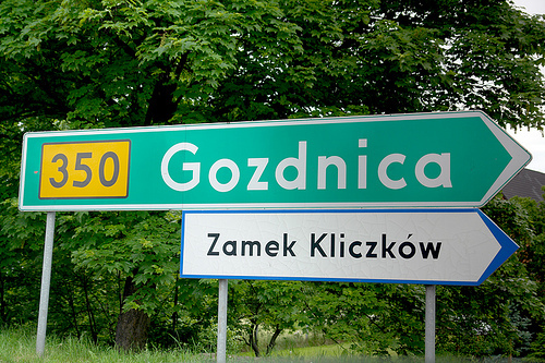
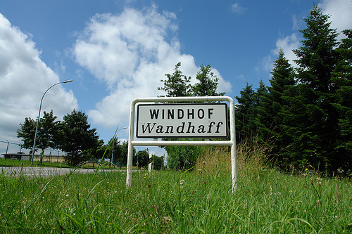
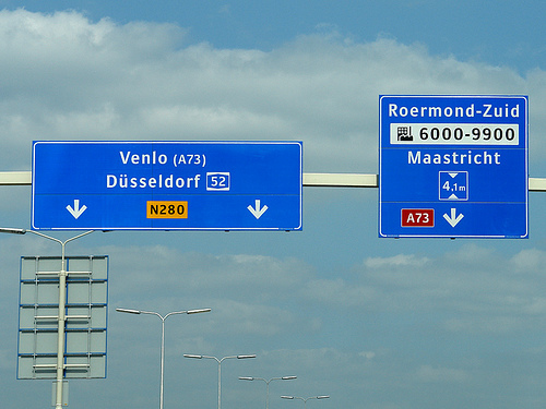
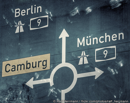
Over the last couple of years I have researched the design and use of typefaces used for signage, especially road signage. While road signs in general are scientifically researched for many decades in western countries, little is known about the parameters that lead to a maximum legibility of typefaces used in signage. And therefore the range of typefaces used on road signs is pretty wide. We see geometric typefaces…
…slanted serif typefaces…
…and many old and modern sans-serif typefaces …
But which ones are most legible? Early road sign typefaces in the beginning of the 20st century were often designed by engineers with a strict geometric or grid-based approach. Newer designs, such as the new typeface in the Netherlands (see image above), are more based on the tradition of print typefaces. But in my opinion, both approaches have their drawbacks, because typefaces used for road signs have very unique requirements. Many people I have talked to seem to believe that speed might be the most important factor for the design of such typefaces, but that is actually not the case. The speed of motorists only influences the duration in which you can read the text on the signs. But that can simply be compensated by the size of the signs. What makes road signs so different from books and magazines is the variable reading distance. So if you want to improve the legibility of a typeface used for signage, the most important task would be to increase the viewing distance. If you are about to pass a huge motorway sign that is 50 meters away, legibility is no problem at all—the letters are so large, they could be set in Comic Sans and could still be read without any trouble. Where you can make a different thru type design is the moment when the motorist is at a distance where the text is just about to become readable.
A new approach
After traveling all over Europe for three years to experience and document as much road signage systems as possible, I started to design my own wayfinding typeface. This was part of my diploma at the Bauhaus University in Weimar, Germany. After all my practical and theoretical research it became clear to me that the regular way of designing a typeface on paper or on screen was not really appropriate. Because designing a typeface for a large viewing distance is not only a question of type design, it is also question of the feasibility of testing. To increase the viewing distance of my design I needed to experience my typeface in this blurry state where it is just about to become readable and I needed to test it when the visibility is decreased, for example by an overglow effect thru the headlights of a car.

That’s where I came up with the idea of my Legibility Tool Tool. It’s an OSX application that allows real-time simulation of different viewing conditions during the design stage. While I was working on the design of individual letters in FontLab, the tool showed me a simulated view of test words with the letters I was just working on. With this tool I could remove the guesswork and was able to optimize my design even for the worst reading conditions.
Often the simulations were quite surprising. Sometimes I was tempted to design my typeface in a way I was used to from the print world, but the tool clearly showed me that the reading conditions of road signs require a unique design for maximum legibility within this context.
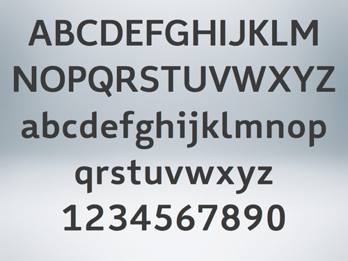
Early version of Wayfinding Sans Pro
About the design
So how does the ultimate signage typeface has to look like? When I evaluated existing signage typefaces with my Legibility Test Tool it became pretty obvious that all those stylistic details that define the overall look of these typeface disappear under difficult reading conditions. What matters most is the skeleton of the letters. On one hand these letter skeletons should be very generic, so they easily match the visual patterns we have learned and seen so many times in our life. But on the other hand, they also need to be somewhat unique. The most generic letter forms do not necessarily create the most legible letters, because too generic letter shapes are harder to differentiate. So in my design I used average proportions as a starting point but I also tried to stress the individual character of each letter.

The “a” is a good example of this approach. The prominent stroke ending on the right may not be necessary to recognize it, but if it is there it helps to distinguish the “a” from other characters. Below is another example: Under difficult reading conditions, details such as the usually rather small crossbars of “f” and “t” get easily lost. Making these parts more prominent can significantly improve the legibility under difficult viewing conditions.

Top: German road sign font DIN 1451, Bottom: My wayfinding typeface
Certain letters can easily be mixed up under difficult viewing conditions. Designing those letters in a way where they are easily distinguishable makes the typeface more legible and increases the maximum viewing distance. Here are some examples…

The missing horizontal crossbar of the Dutch road signage font (orange) makes C and G harder to distinguish. In blue are C and G in my typeface. The difference between the letters is easily recognizeable.
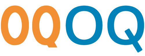
Poor differentiation of O and Q in the French road signage typeface (orange). On the right are O and Q in my typeface.
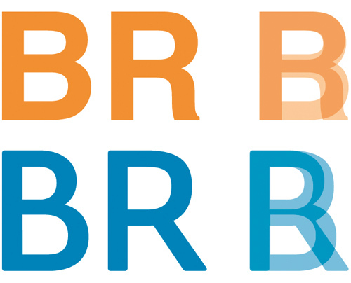
Helvetica (orange) has many letters that are designed very similar, which is not really helpful when used for signage. A more unique design helps to differentiate the letters.
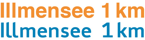
Another typical example: capital I, lowercase l and the figure 1 should better be designed in a rather unique way.
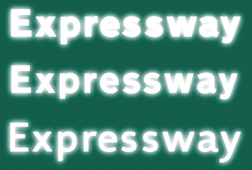
The stroke width is another important factor of a typeface used for signage. “The bigger the better” does’t work in this context—quite the opposite is true. Modern retroreflective sheeting of road signs create an overglow effect which affects the legibility. But this problem is not limited to road signs. Backlit signs in airports, hospitals and office buildings also suffer from this problem. The typeface design should compensate for this overglow effect. This can be achieved by using a thinner stroke width and by opening up the counters of the letters.
Top: Road signage typeface in Spain and Italy; Middle: Transport Bold (United Kingdom); Bottom: My wayfinding typeface
Figures are also crucial when a typeface is used for signage. In print typefaces the figures are mostly designed rather inconspicuously so they don’t stick out from the text. But figures in a signage typeface need to be very clear and easily distinguishable. The standard figures in my wayfinding typeface are tabular lining figures to accommodate the typical tabular use. But old-style figures (both proportional and tabular) are also available.

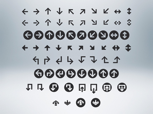
My wayfinding typeface also comes with a large set of arrows. They perfectly match the metrics and stroke withs of the typeface and can therefore be placed along with the text without any further corrections.
Positive and negative contrasts are often combined on one sign. Since light text on dark background always appears bolder, this can create an unwanted differentiation. A good signage typeface should compensate for this effect by offering different stroke weights to be used for positive and negative contrast.
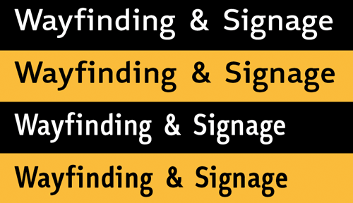
Different stroke widths to be used for positive/negative contrast (only visible when the background is removed)
When I designed this typeface I usually had road sign in mind, but the typeface is not limited to this context. I can be used for all kinds of signage projects.

Ralf Herrmann, September 2009