Jump to content

Elfen-Fraktur

Designed by: M. Beck, Ralf Herrmann

Released: 2015

Number of styles: 2

Script support: Basic Latin

Most suitable for: Display Use (logos, headlines, …)

Notes: This font contains glyphs and/or features which are only accessible with fully OpenType-savvy applications.

Elfen-Fraktur is monolinear blackletter typeface, that was originally designed by M. Beck and published in 1919. This revival comes in two extended versions with a complete Latin 1 character set: Elfen-Fraktur A uses the original blackletter skeletons and is suitable for setting texts with traditional German typesetting and orthography rules. Elfen-Fraktur B includes modernized letter designs for a broader and more legible use in various languages. A free bonus is the set of 22 border elements called Elfen-Schmuck.


Prints in the original metal version of Elfen-Fraktur

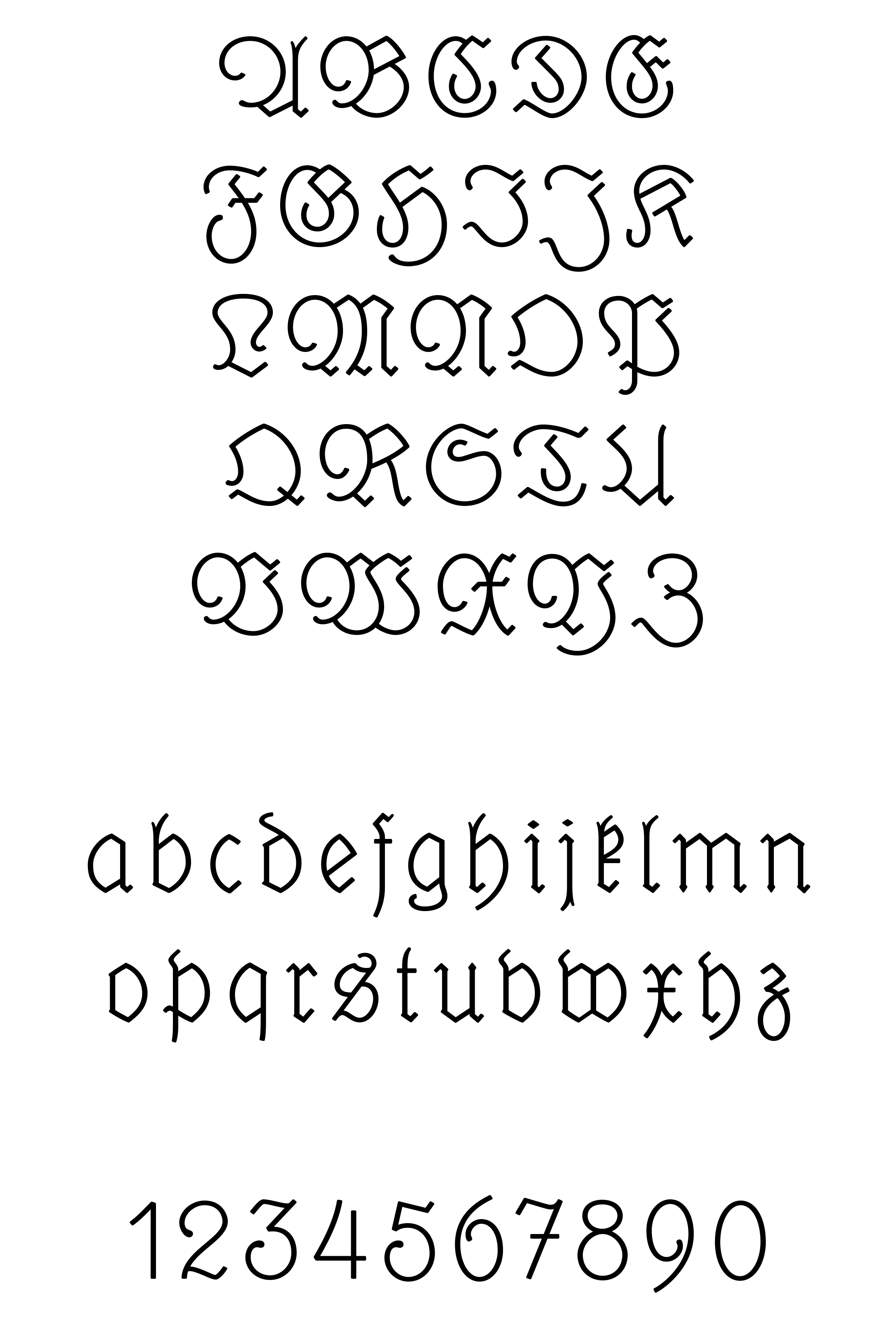
Elfen-Fraktur A — Traditional Alphabet

Elfen-Fraktur B — Modernized Alphabet

A B
»Recht ſo, kleiner Geſelle! Wohl geſprungen und tüchtig!« Aber in demſelben Augenblick, wo er dieſe Worte ausgeſprochen hatte, verfinſterte sich die Nacht und die Elfen verſchwanden mit Blitzesſchnelle.
“Bravo! little fellow,” said he, “well kicked and strong.” But the instant he uttered the words the night was darkened, and the fairies vanished with the speed of lightning.

Additional Links

Type Specimen PDF

Elfen-Fraktur in Use

  • Important Information

    We use functional cookies to help make this website better.