Wayfinding Sans Pro


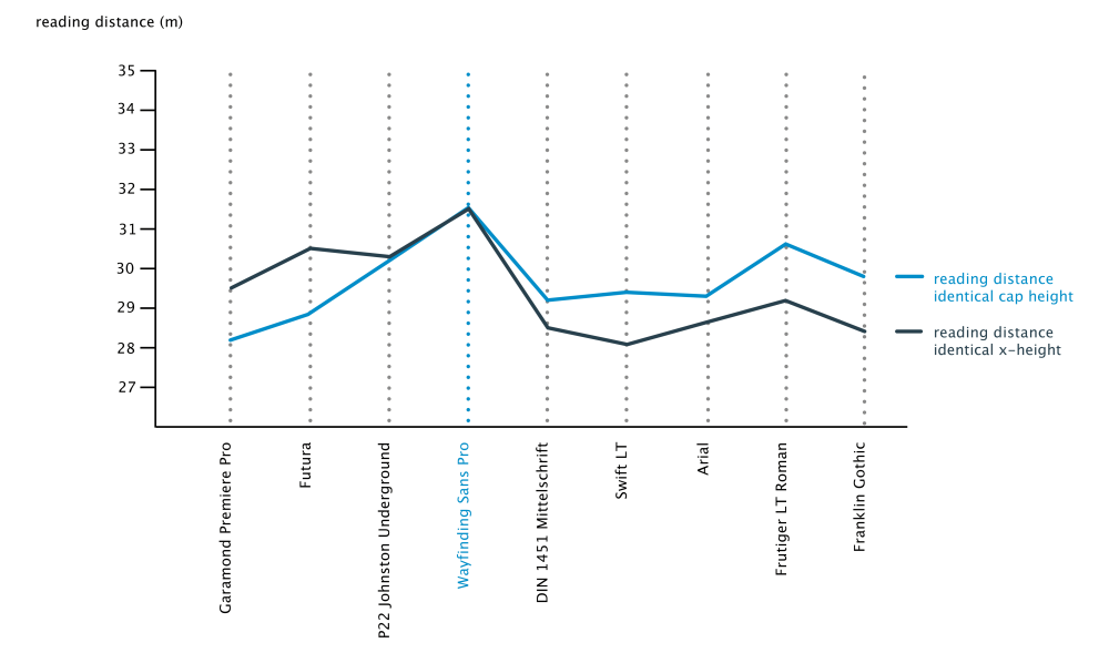
Superior legibility. Empirically proven. In an independent empirical study at the University of Applied Sciences “htw” in Berlin different typefaces were tested when used on signs and Wayfinding Sans Pro (bold extended) was the winner in all conducted tests, being significantly more legible and therefore superior to all other styles of the tested typefaces—among them typical signage typefaces like Frutiger, DIN 1451, Johnston Underground and Futura.
Developed with an innovative design approach: The actual type design was done using a unique custom real-time simulation software, which could simulate difficult reading conditions (distance, fog, halation, positive/negative contrast) while the letters where actually designed.
Even though legibility studies are not uncommon, they usually just test existing typefaces and the results don’t really tell which design paramters were actually responsible for the results. But since the legibility simulation was an integral part of the development of Wayfinding Sans Pro, there was the possibility to optimize even the tiniest details of each letter for maximum legibility.

Being made specifically for wayfinding purposes, this type family does not compromise on any aspect of legibility—and yet, the typeface is a beautiful, clean and modern sans serif. With its broad language support and the large number of available styles it is perfectly suitable for any possible signage project anywhere on the world.
So Wayfinding Sans Pro is not only suitable for the legibility demands of road or airport signage. The type family is also a professional choice for signage systems for train stations, office buildings, schools and universities, malls, parking lots, parks, sport stadiums and so on.

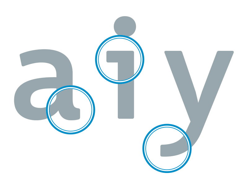
Designed for recognizability: To increase the possible viewing distance, the skeleton of the letters of a signage typeface need to be generic and familiar but also unmistakable. And this is exactly how Wayfinding Sans Pro was designed from the ground up.
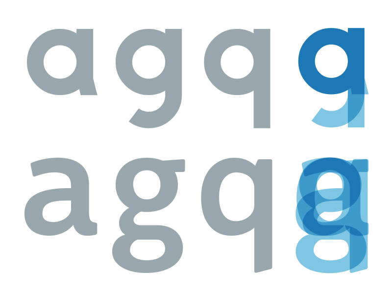
Under difficult viewing condition, letter differenciation becomes crucial and can make a big difference. A clear, structural difference achieves good distinguishability. Top: Polish road signage font. Bottom: Wayfinding Sans Pro
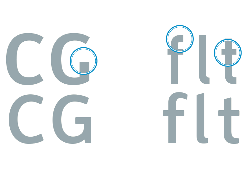
Top: Dutch road signage font
Bottom: Wayfinding Sans Pro
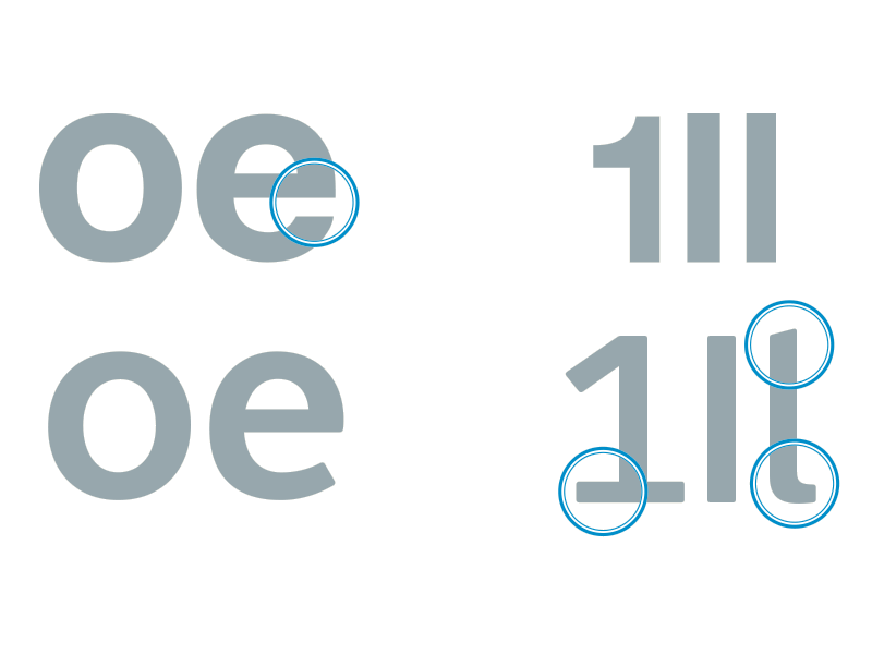
Top: Helvetica
Bottom: Wayfinding Sans Pro

On signs the diacritical marks must be unmistakable in their design and prominent in their size. British road signage font (top) – Polish road signage font (middle) – Wayfinding Sans (bottom)
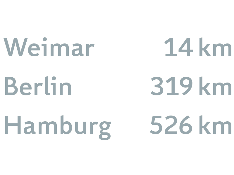
Figures optimized for the requirements of signage use: maximum distinguishability and lining tabular design. Oldstyle and proportional figures as well as a slashed zero are available as OpenType features.
Additional Links
Related Questions
Important Information
We use functional cookies to help make this website better.


