


Iwan Reschniev

Designed by: Jan Tschichold, Sebastian Nagel
Released: 2008
Number of styles: 7
Script support: Basic Latin
Most suitable for: Display Use (logos, headlines, …)
Not recommended for: long texts
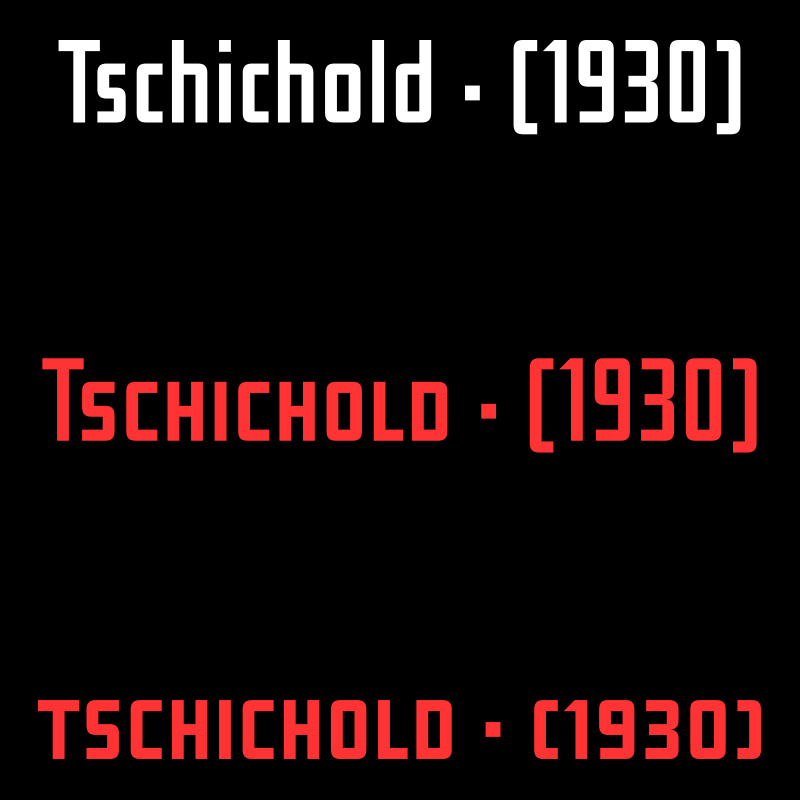
In 1930 Jan Tschichold describes a new typeface in the publication “Börsenblatt für den Deutschen Buchhandels”, that “can be drawn by everyone without typographic knowledge”. Sebastian Nagel extended the original drawing to 7 weights (black, extrabold, bold, semibold, regular, semilight and light), with full coverage of the Latin 1 character set. All fonts also include small caps and alternate characters.

Jan Tschichold’s sketches for this typeface


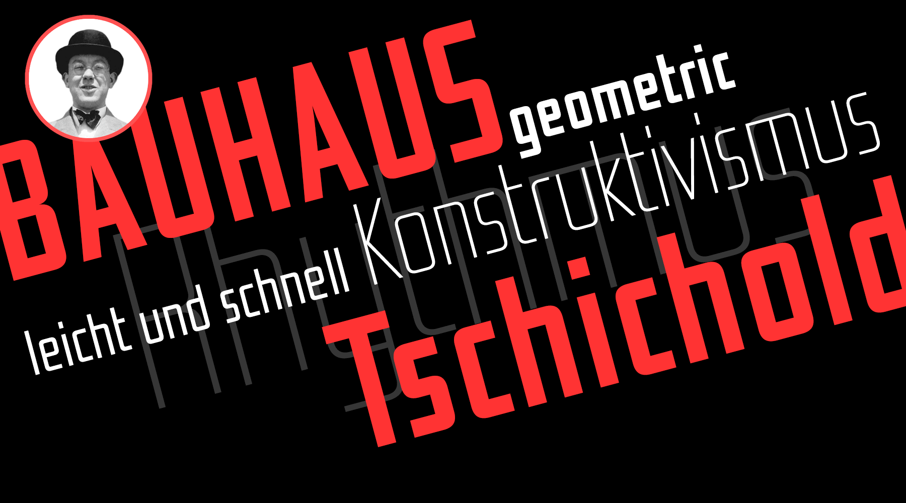
After the artistically decorated Art Nouveau style around 1900, counter movements such as De Stijl and constructivism spread across Europe in the early 20th century. The Bauhaus school—founded in 1919 in Weimar—became a German center for this development. Bauhaus designers such as Herbert Bayer and László Moholy-Nagy proposed radical simplifications to writing and typography. Why use a double-storey alphabet, when only one would do? Why use letter shapes derived from writing, when letter can be simplified and printed from geometric shapes like squares and circles?
The Bauhaus ideas, designs and products where presented to the world for the first time in 1923 in an exhibition in Weimar. Jan Tschichold—being just 21 at that time—visited this exhibition and was overwhelmed by what he saw. The Bauhaus influence can clearly be seen in his works created in the following years. But it didn’t stop there. Tschichold became one of the most influential promoters of the new design movement. In 1925 he published his famous manifesto “Elementare Typographie” and later the book “Die neue Typographie”, which heavily influenced typography and graphic of the time.
Like the Bauhaus masters, Tschichold became a supporter of simple sans serif typefaces, which he considered the manifestation of his aim for “simplicity and clarity”. But unlike today, fonts were only used for printed matters. The letters in logos or signs where usually drawn by hand and Tschichold was never satisfied with the quality of such works. “Nearly all writing, that we encounter, is bad, insufficient, or wild.” So he became an educator and tried to spread his knowledge of typography and writing in countless essays and books.

His sans serif design from 1930 reflects Tschichold’s design views from that time. A well-balanced design, but being based on a grid, simple enough for everyone to be drawn. The original design had just the basic letters for German type-setting. The FDI version by Sebastian Nagel comes with a full Latin 1 character set and small caps. In addition to the original design (black), six lighter weights are also available.
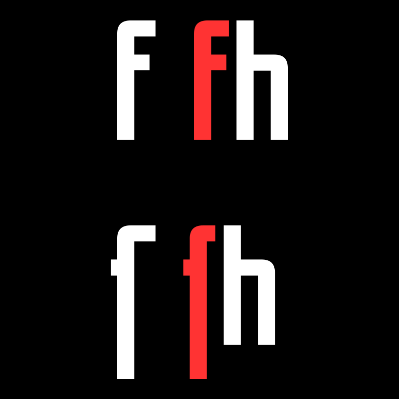
Contextual alternates feature: Shorter versions of f and ſ, which are automatically used when followed by a character with an ascender.
OpenType small caps: A full set of small caps with matching punctuation marks.
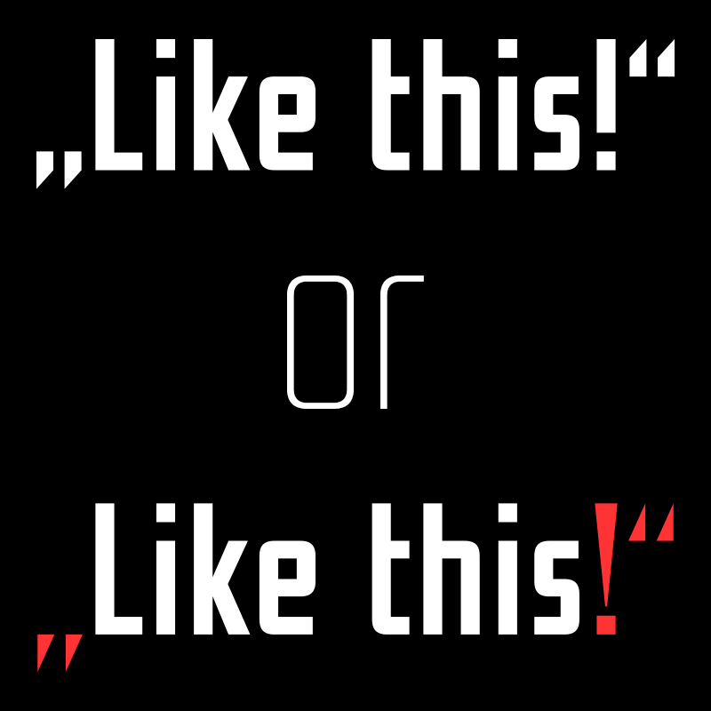
Stylistic set 1: a set of punctuation marks, which stick closer to Tschichold’s original drawings.
Additional Links
Related Questions
Important Information
We use functional cookies to help make this website better.