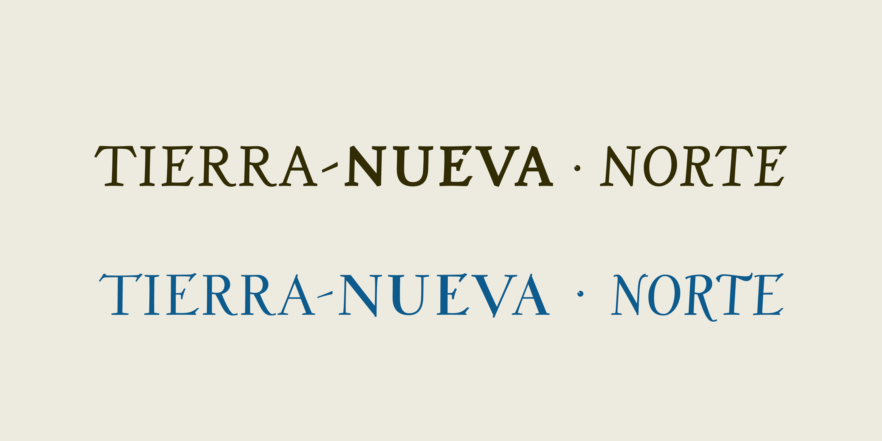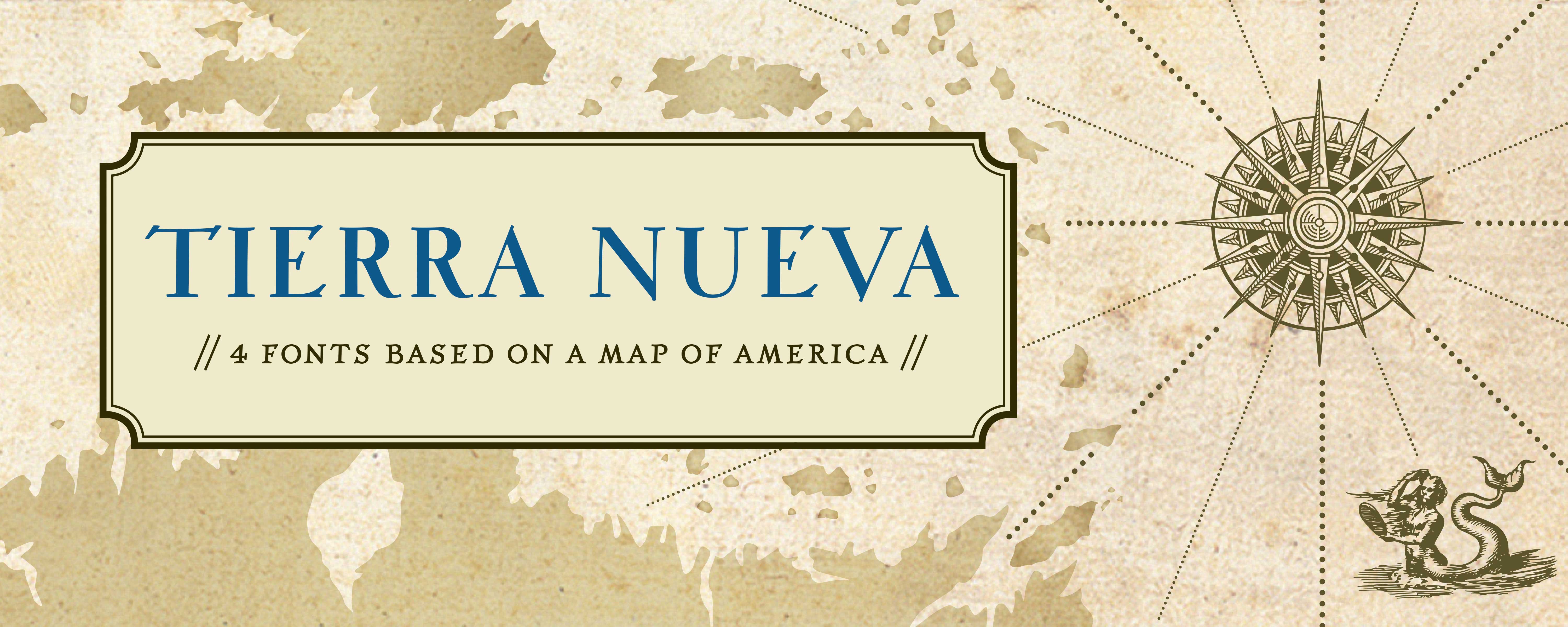
Tierra Nueva
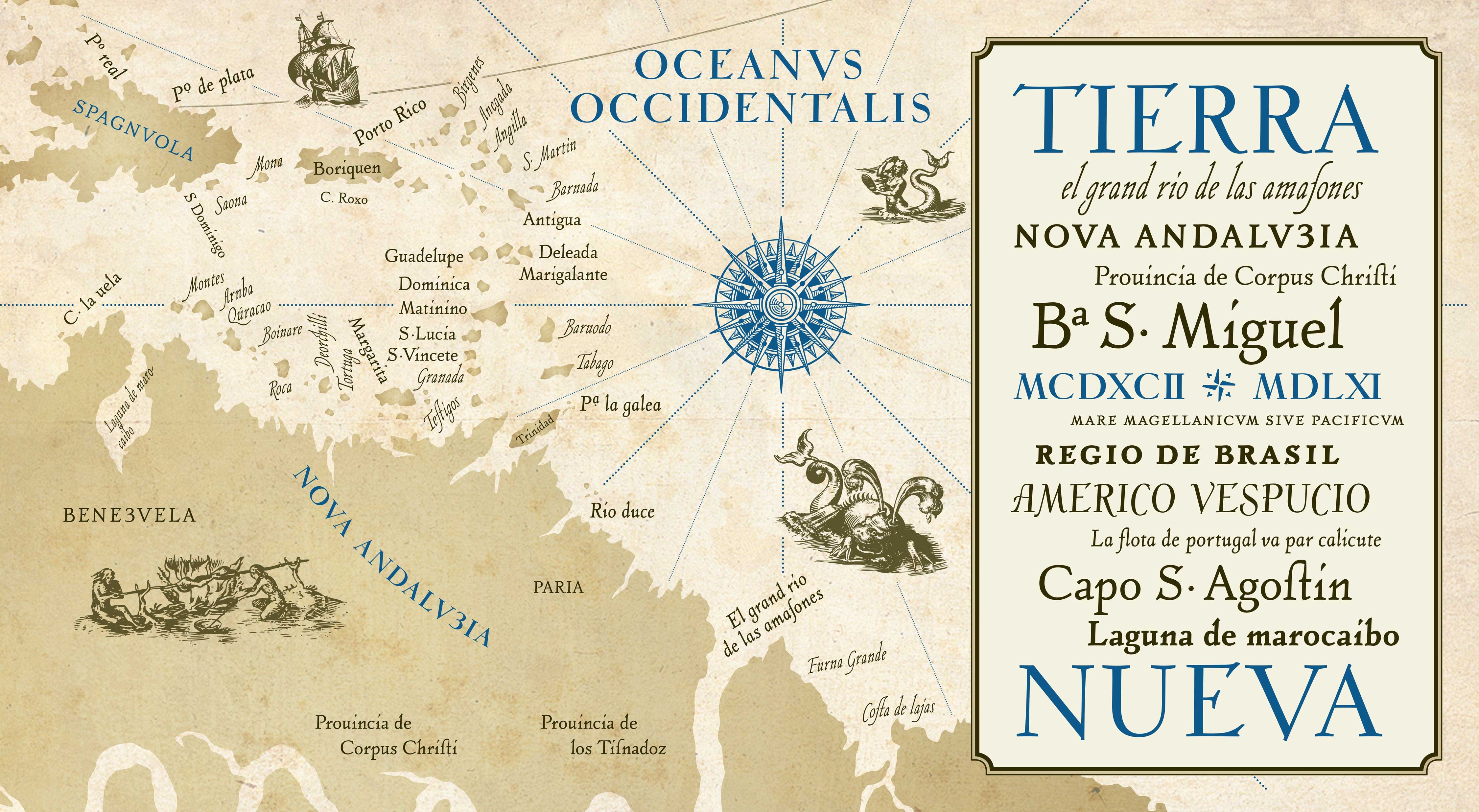
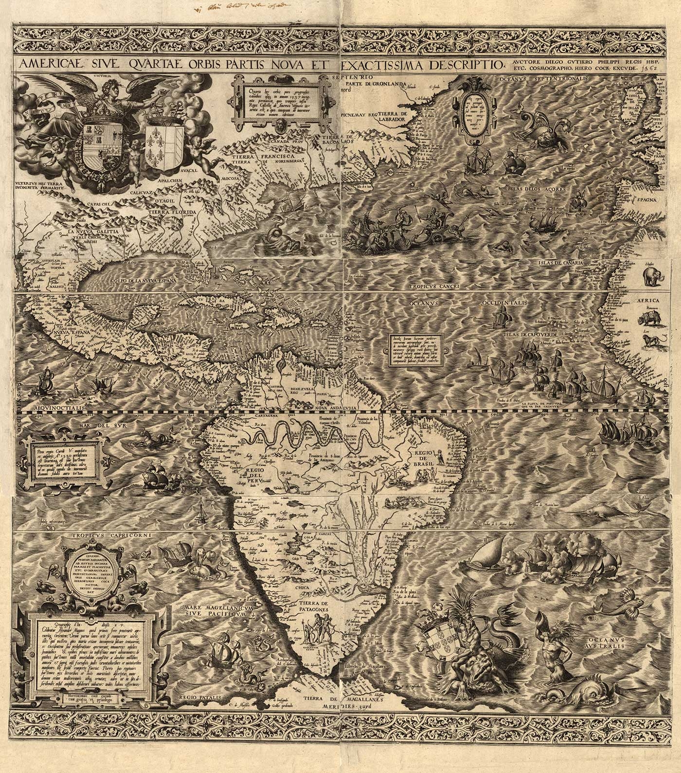
“When I—by chance—in 2004 discovered the map of America from 1562, that was created by the spanish cartographer Diego Guiterrez and the dutch engraver Hieronymus Cock, I just had finished my diploma thesis about type design and type analysis. In this time, I was experimenting on own type designs, but as a beginner, I wasn’t able to answer the many conceptual and formal questions that arose soon. The engravers’ map with its detailed geographical notes offered me a chance to explore the used writing, and to start experimenting on an own interpretation of it. As the main design principles were already set, I was – at least for the beginning – able to concentrate on less basic details and learn by looking, analysing and by doing.
On my first try to create a fully functional, universally useful digital typeface, I soon realised that mere tracing of selected single characters would not lead me to a satisfying result: the characters that were formed individually by engraving did only work in their specific context of lettering, but not combined with others taken from other words. So I decided to redraw each character and, without giving up the basic impression of the typeface, to unify and streamline details, so they could work together in all contexts.
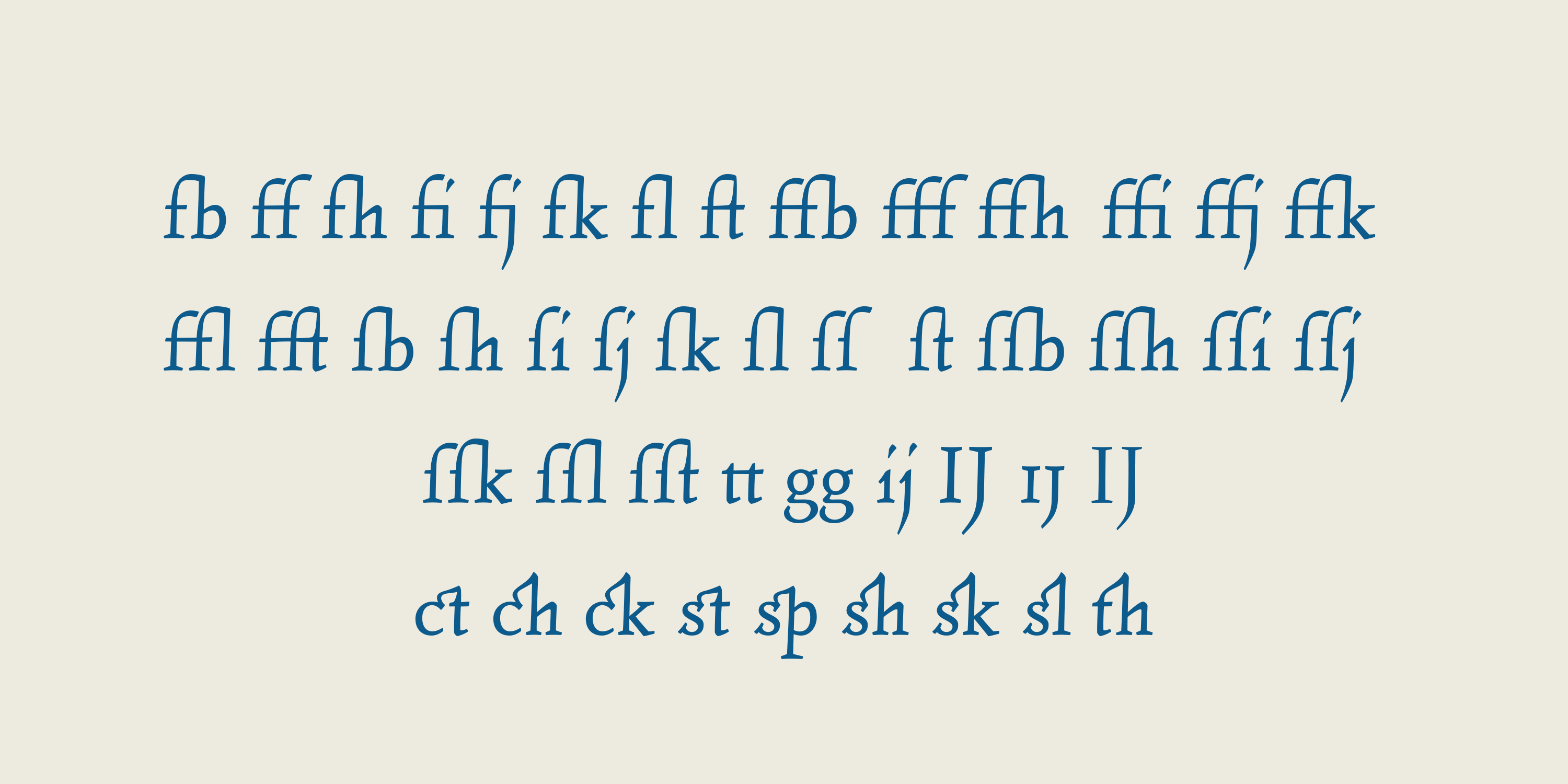
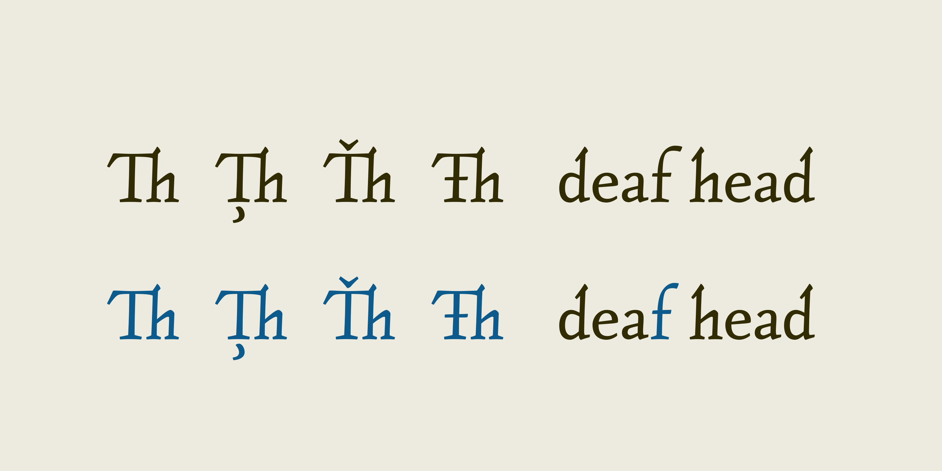
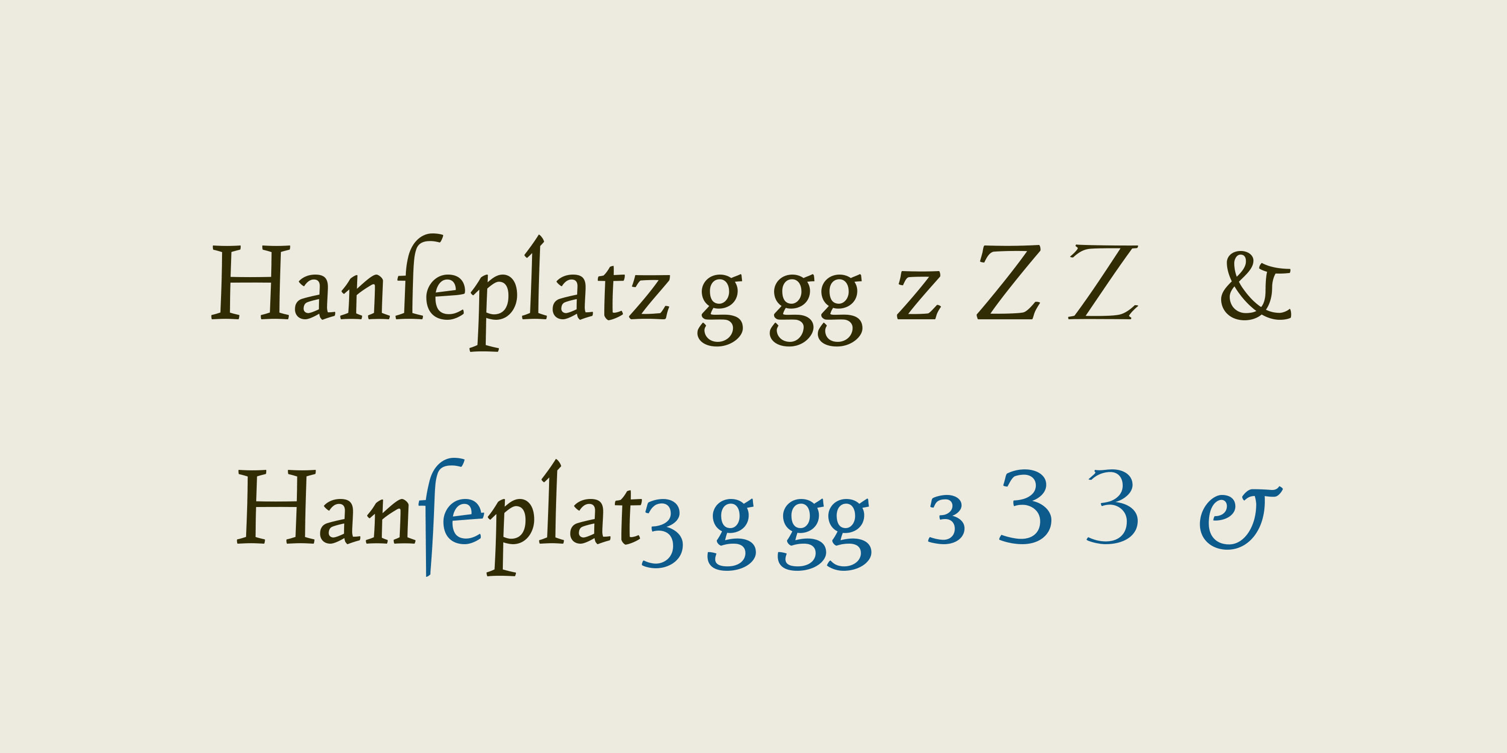
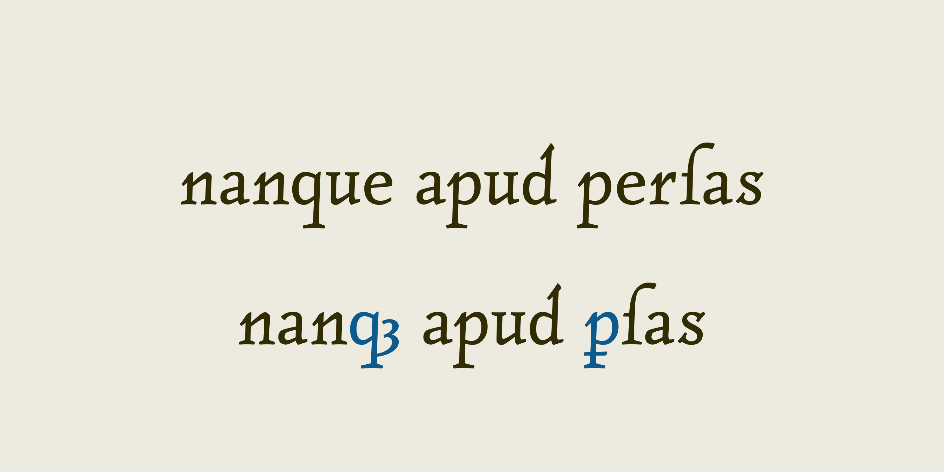
In 2010, Tierra Nueva has gone a long way. On its journey of exploration it has grown to 4 members of a family (regular, bold, italic and script) with an overall count of almost 3.700 characters for different languages and purposes. So, over 6 years after the start of the expedition, it shall be launched. Land ahoy!”
— Sebastian Nagel, 2010
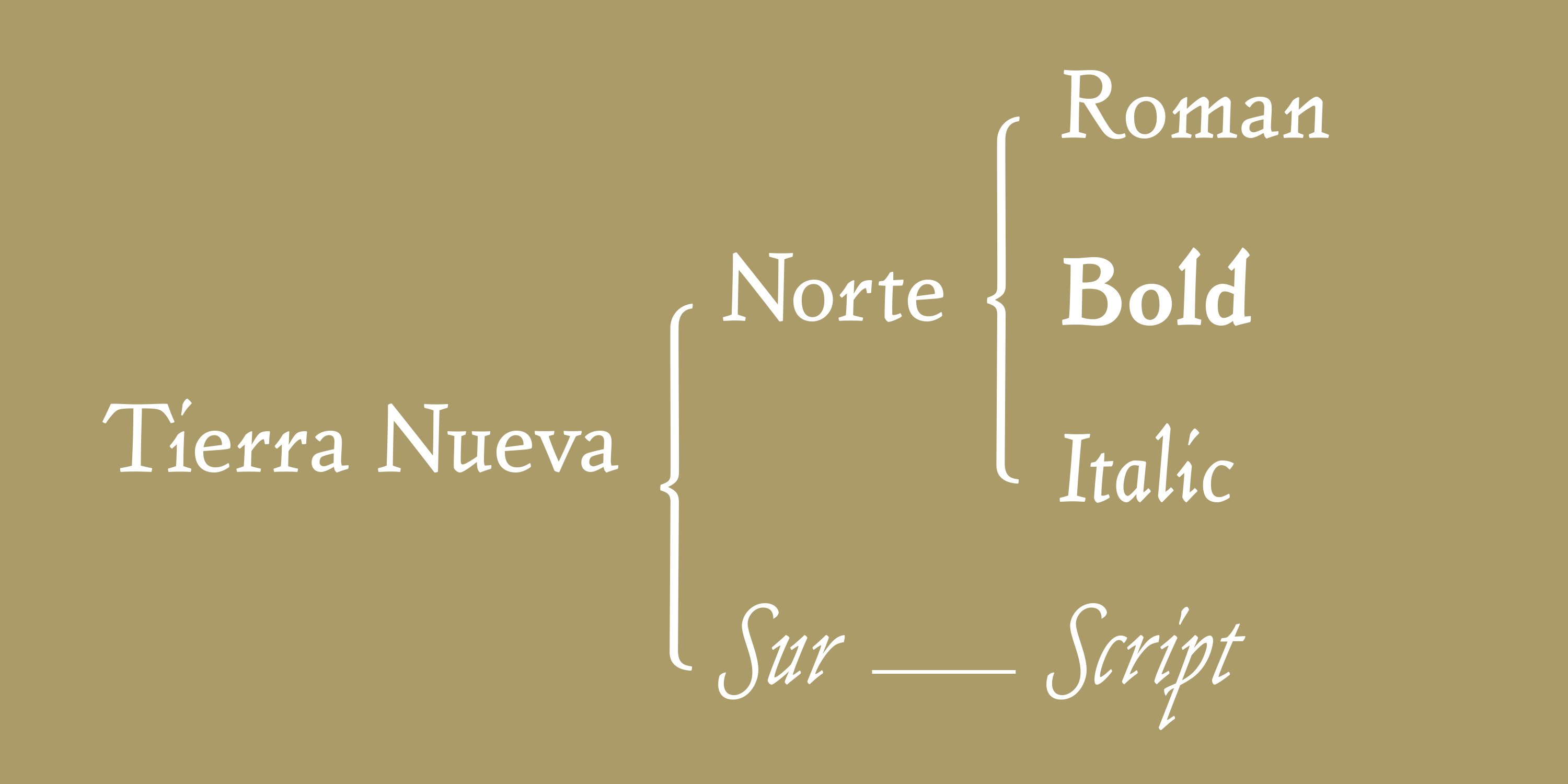
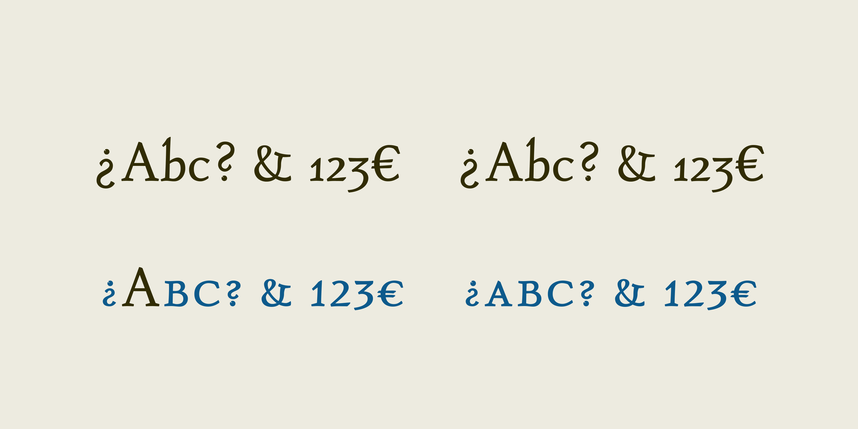
A family of four carefully crafted fonts.
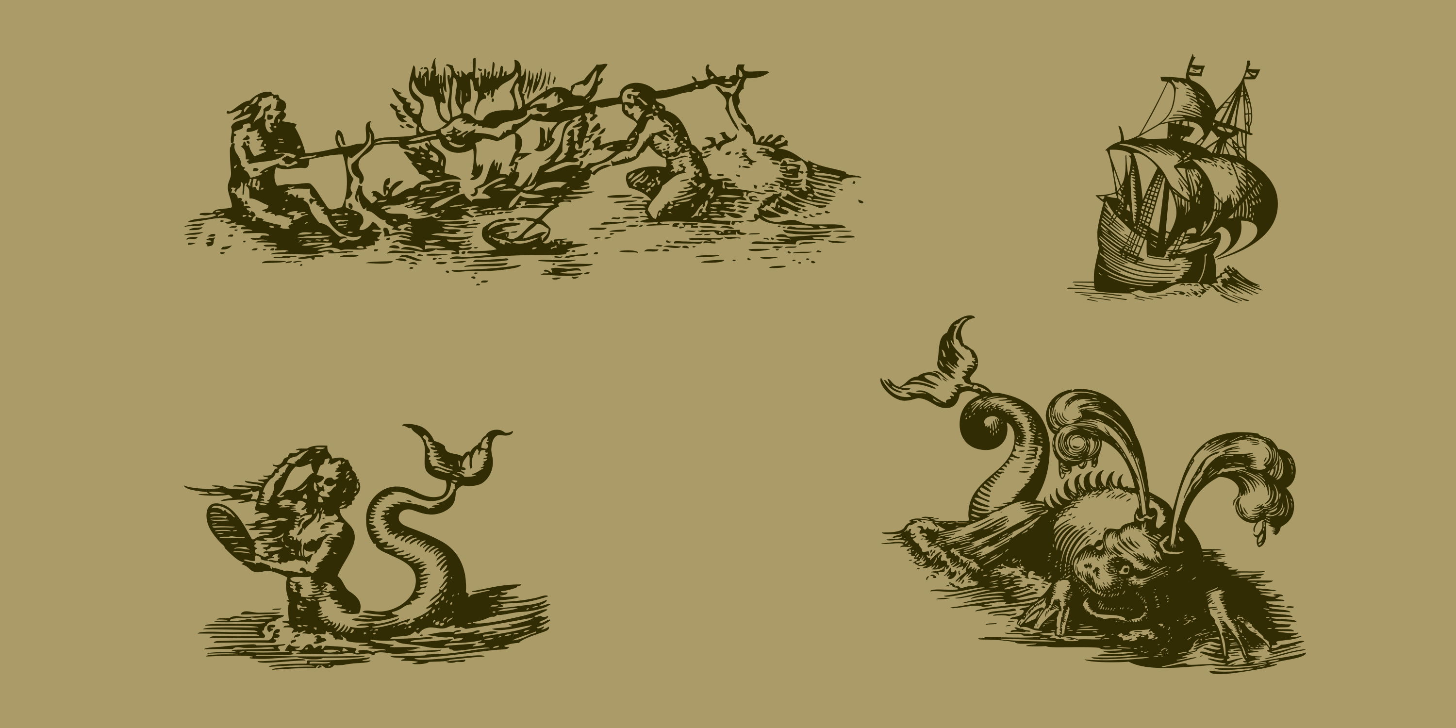
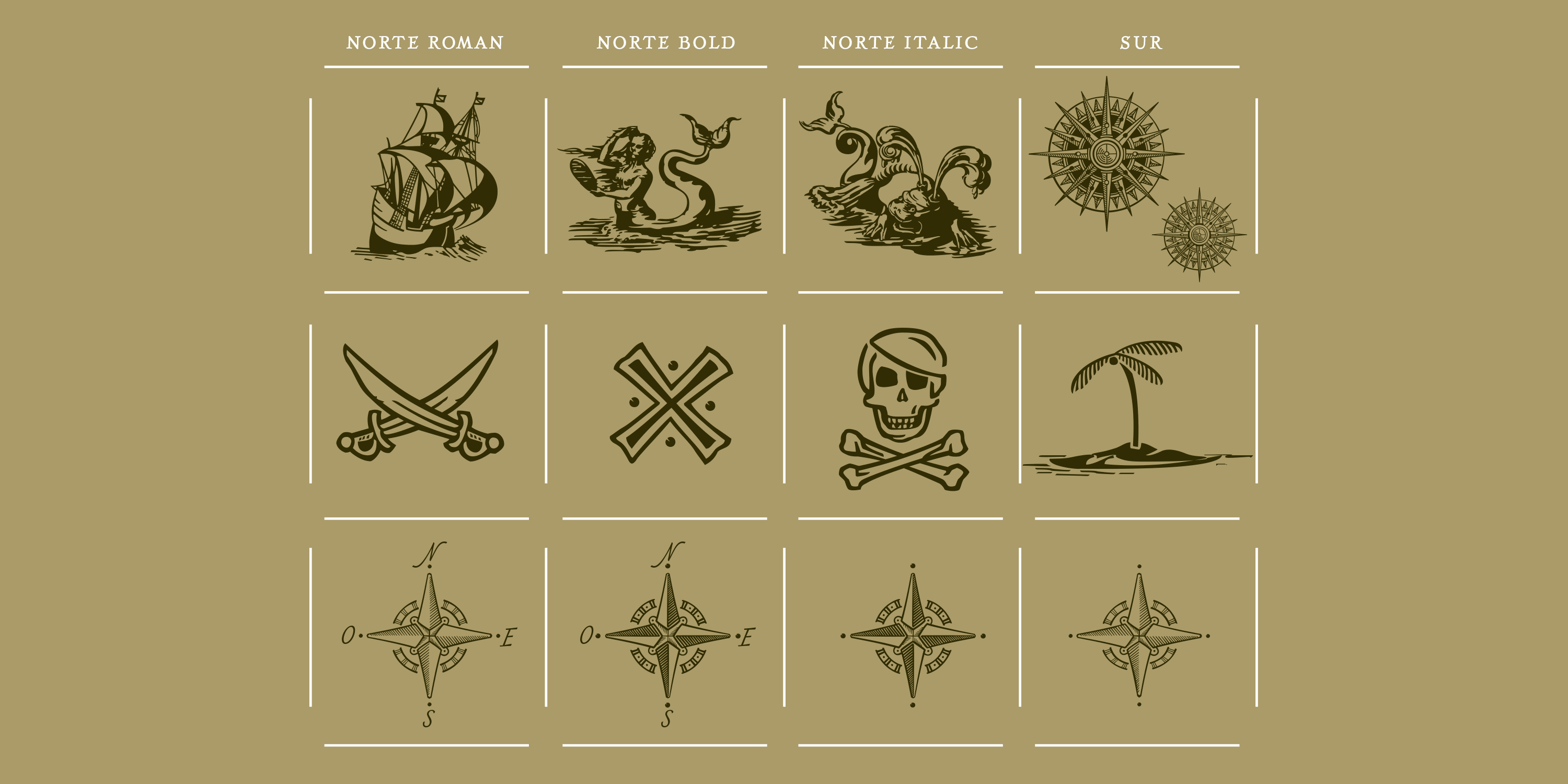
Detailed vector graphics for customers who buy the whole font family.
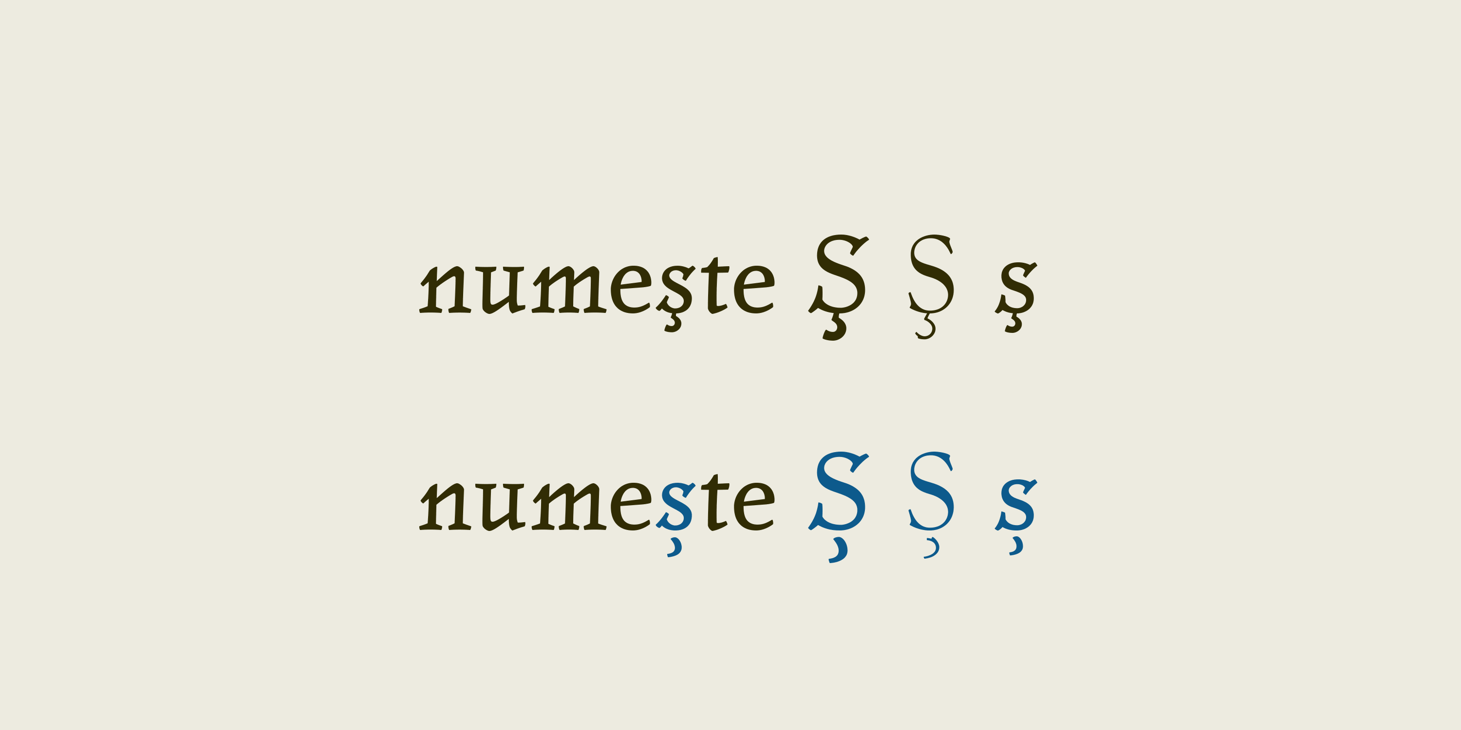
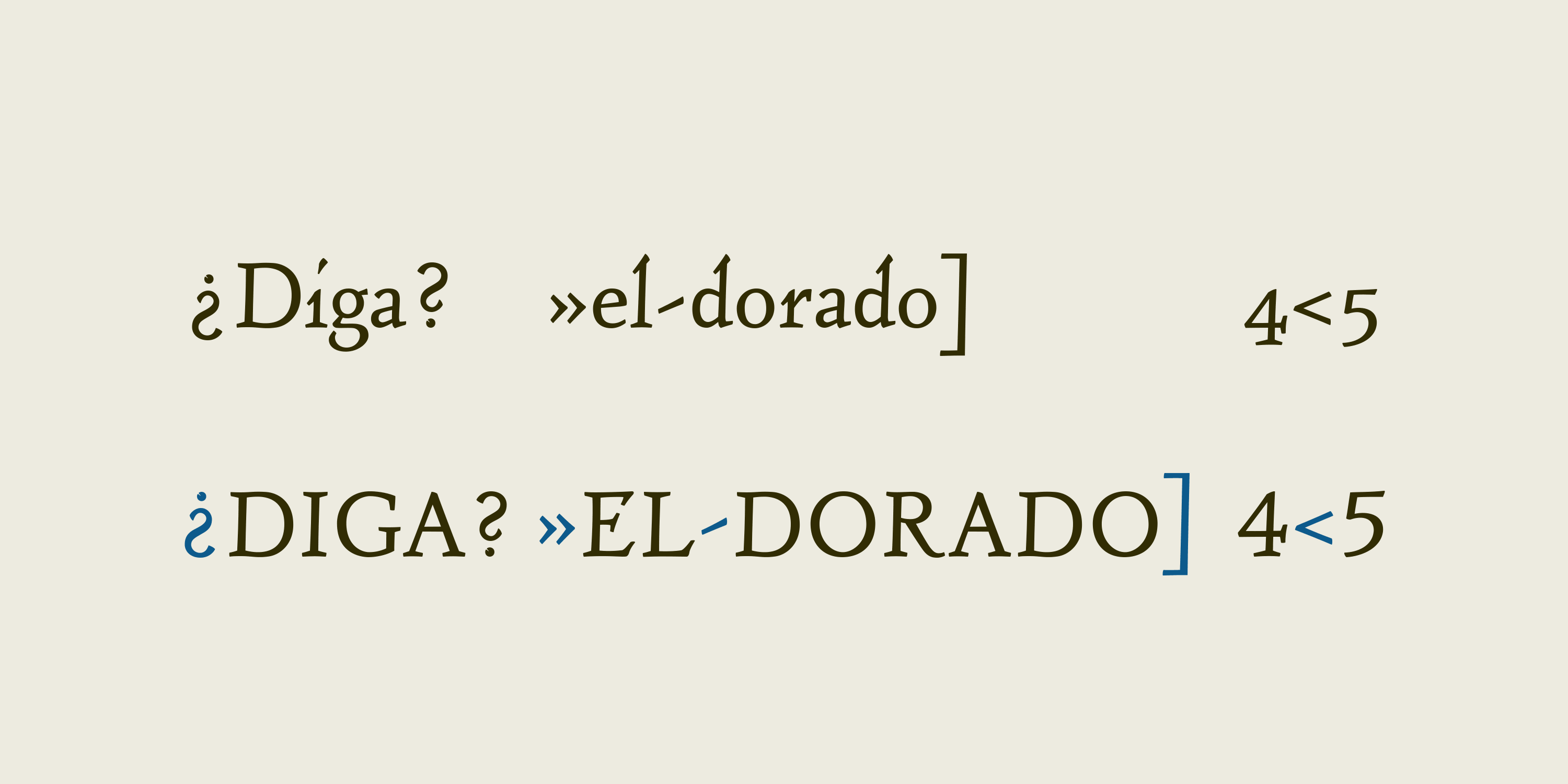
Localized Forms
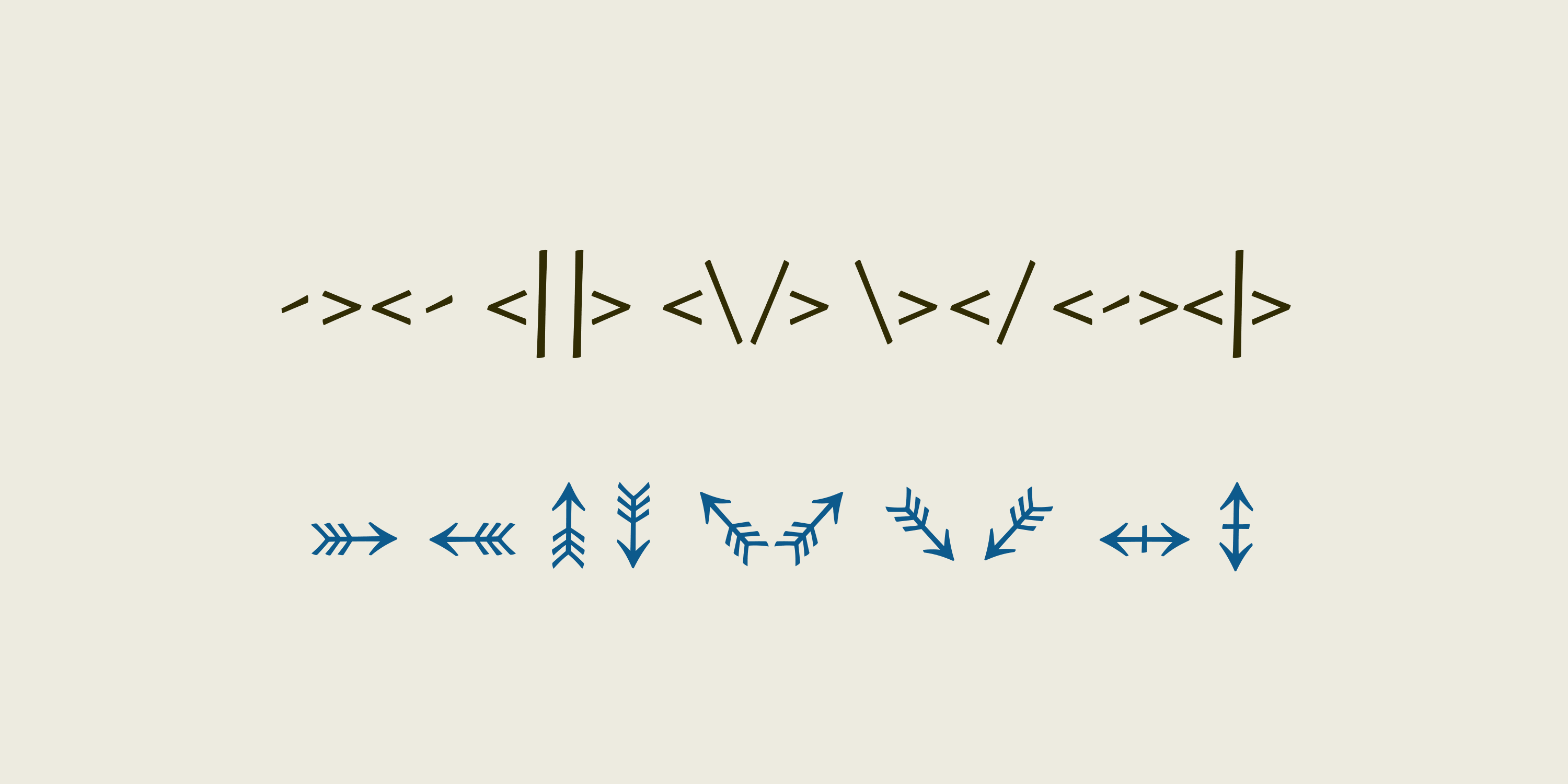
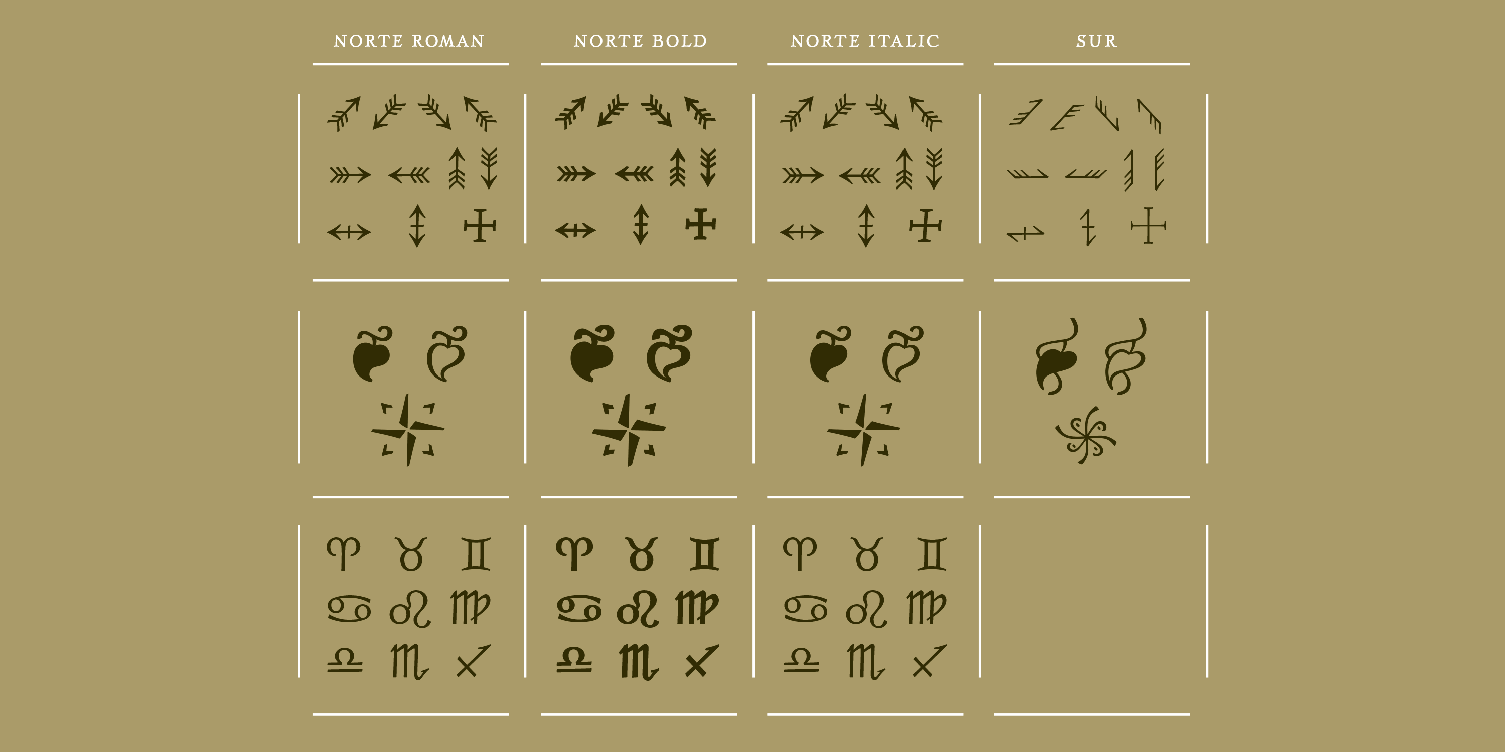
Stylistic Set 1. Arrows
Additional Links
Related Questions
Important Information
We use functional cookies to help make this website better.


